our new identity!
Time for a new Look


Brand Legacy
Since 2009, when Interactive Things was founded, the design studio never had a strong visual identity. The geometrical logotype was simple, set in all caps and notably combined with a secondary serif typface. It was often accompanied by a plain badge, serving as a fill-in for an official brandmark. This combination always felt tacked on and didn't form a strong composition. Over the course of six years we figured out the limitations and inconsistency of our corporate design and felt ready for a fresh and new logo.
Inspiration
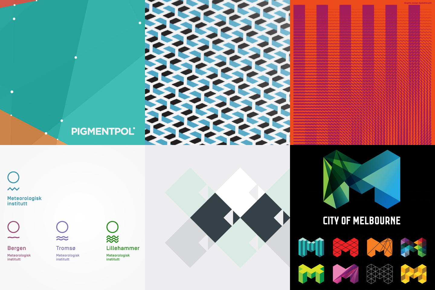
When we started looking for inspiration, we aspired for clarity and simplicity in terms of how a logo is constructed and manifested. Since day one of Interactive Things, it has been in our DNA to combine simplicity with a touch of playfulness. For that reason it was important to us to have a logo that reflects these values well. We wanted to learn from the best and we've been inspired by the work of neue.no, FELD Studio, and many others.
“
I strive for two things in design: Simplicity & clarity. Great design is born of those two things.
— Lindon Leader
Process
We love the descriptive but playful character of our name, and it has become more and more known over the last several years. It is here to stay. Our name stood at the beginning of the process, challenging us to reflect who we are, what we do, what a “thing” is, and what “interactive things” look like.
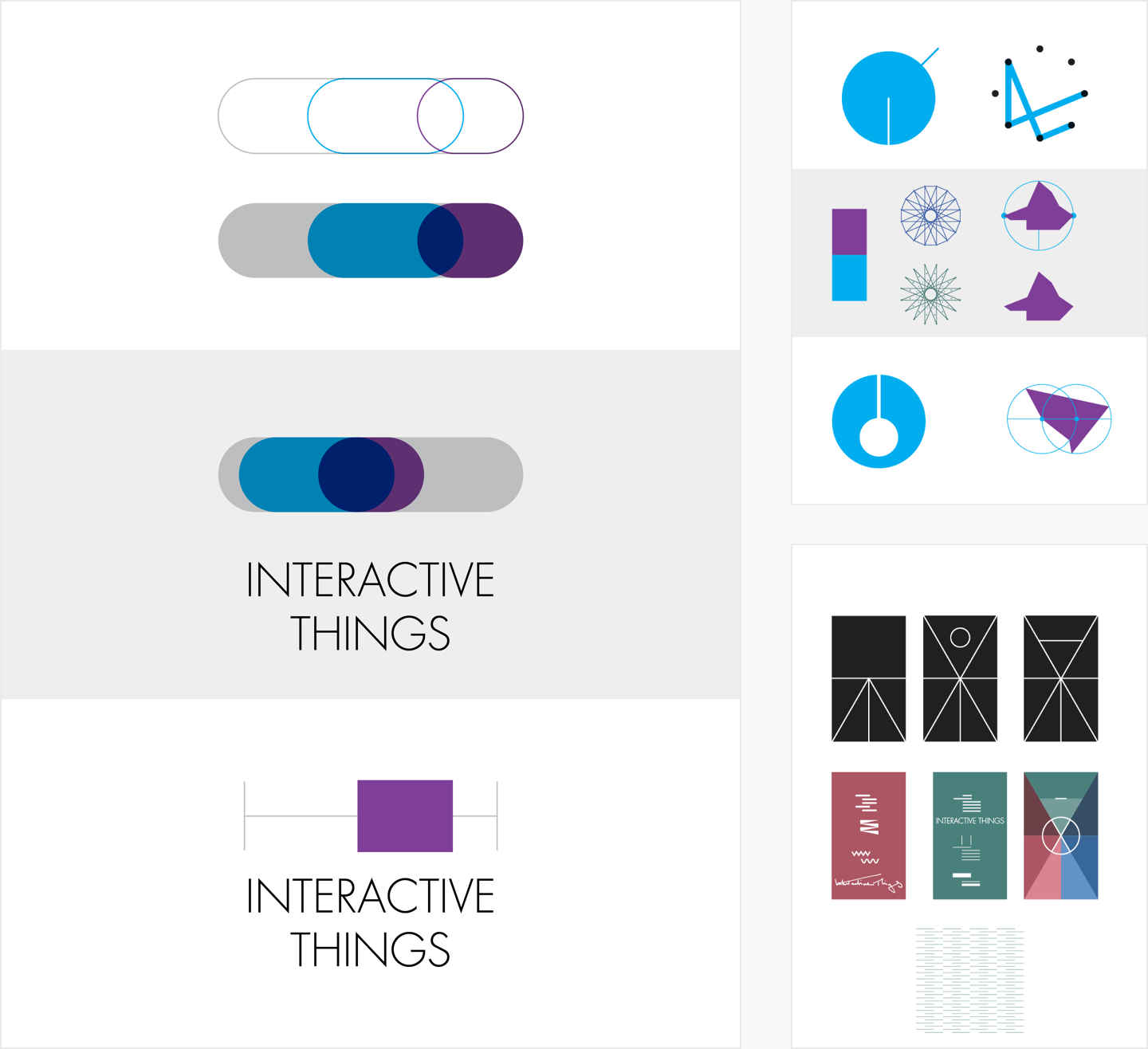
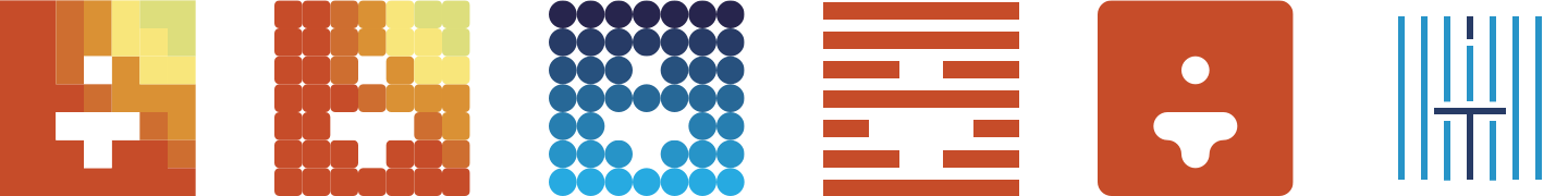
The journey started with particle systems. A thing as a small particle or artefact, represented by a simple dot, interacting with other particles, coming alive, playing and building metaphorical formations.
We quickly figured out that this wouldn’t satisfy us. Because of the inherent randomness it was difficult to condense a strong, characteristic mark out of a bunch of particles. We also didn’t like the complexity of the outcome. We iterated our concepts and pursued another approach, to investigate more about the interaction between only two objects.
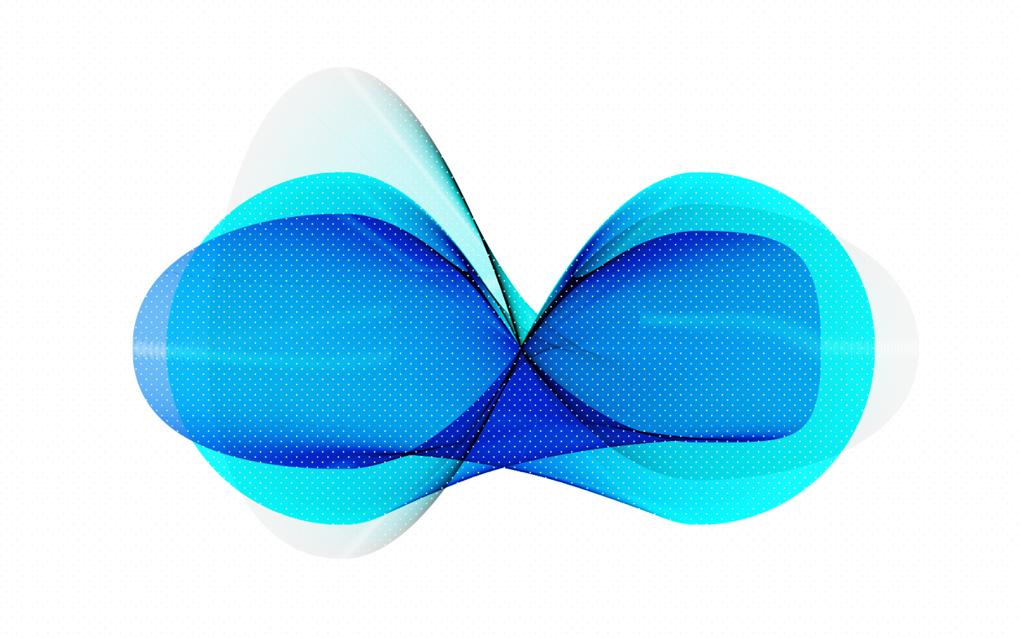
Based on that idea, we started to analyze the interaction between ordinary things like earth and moon, mother and child, body and soul. We created the foundation for the base and the flare.
From a separate idea of having the human at the center of our brand, we combined both approaches and got an abstract human body, which not only represents itself, but can also be seen as a fusion of our initial letters “I” and “T”.
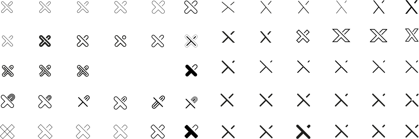
What was missing was the “X” of our name’s short form, “IXT”. Tilting the mark by 45° led us to its final and appealing form.

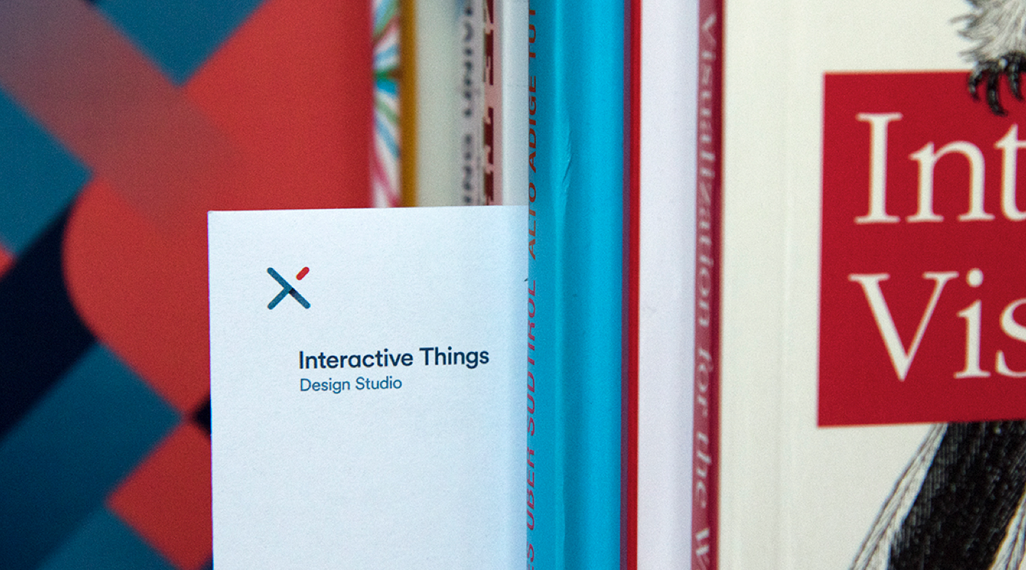
Result
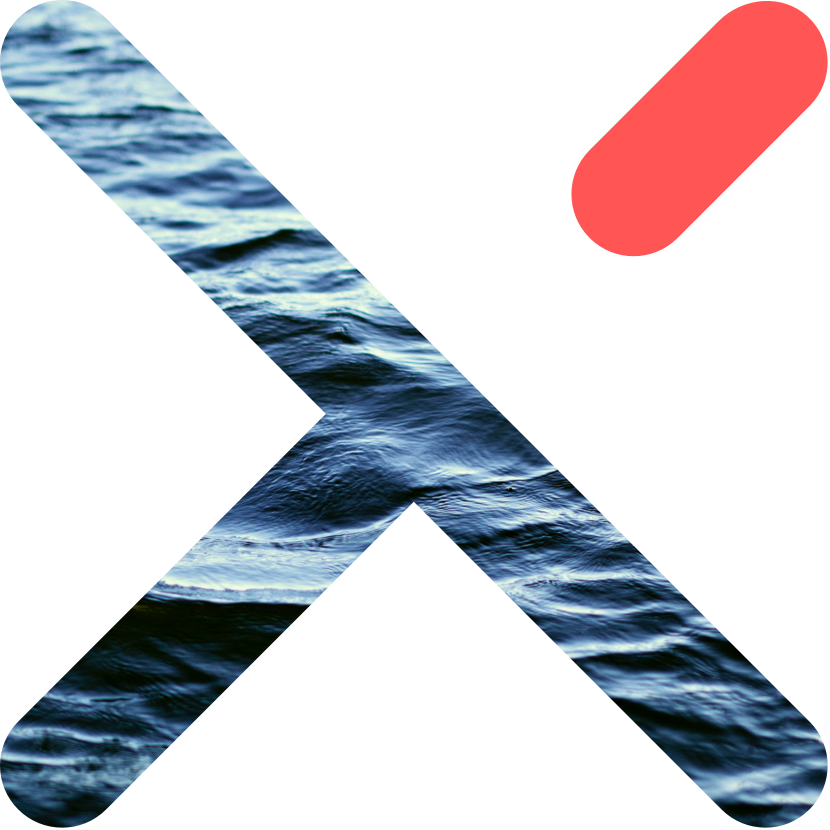
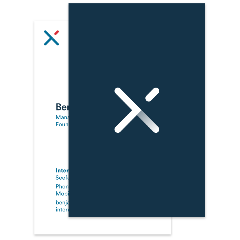
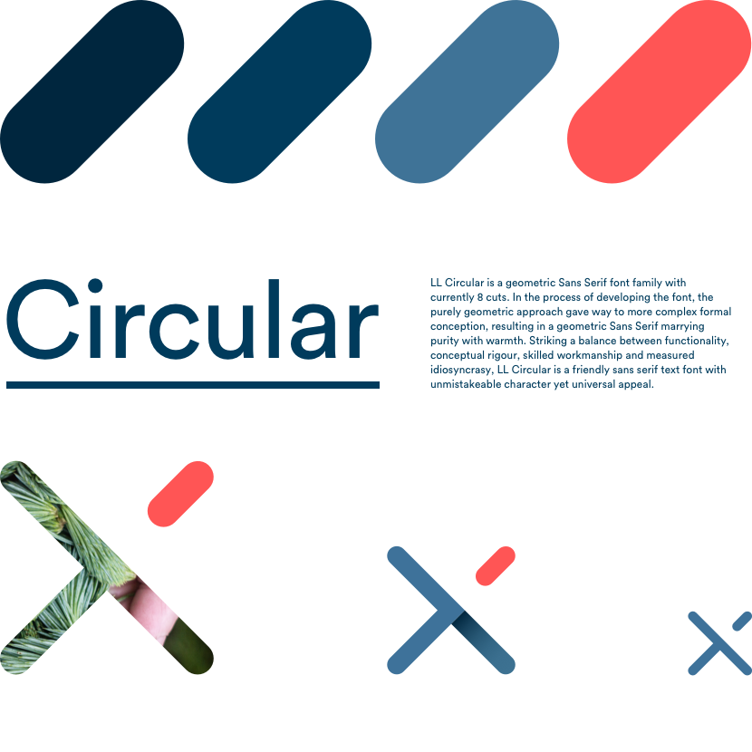
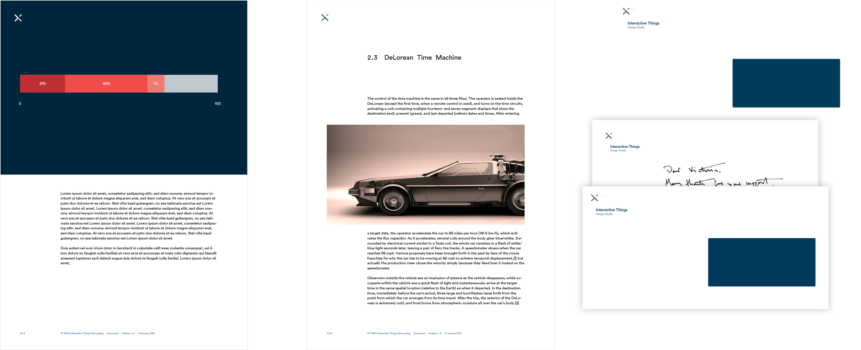
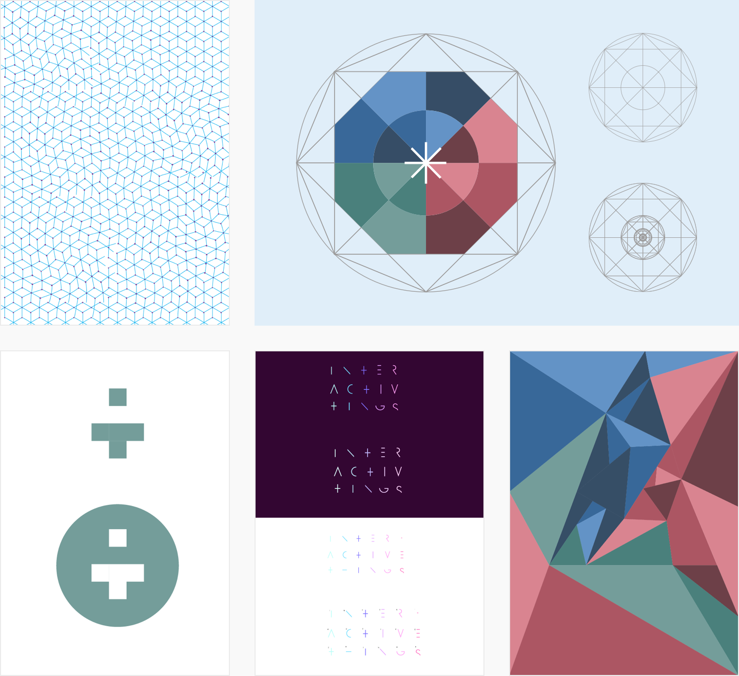
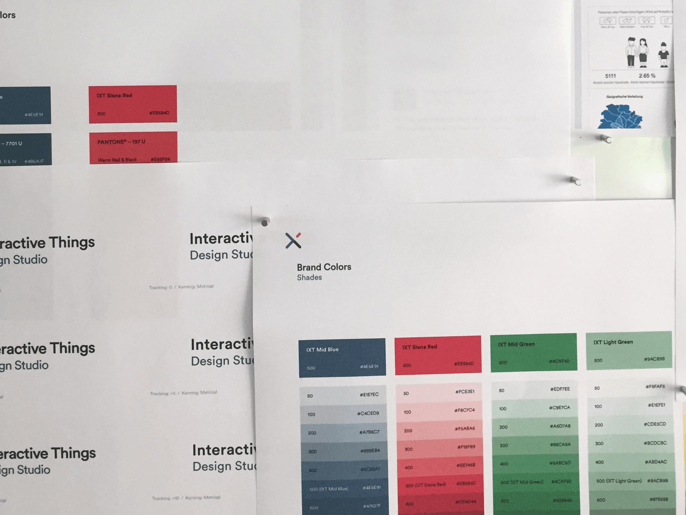
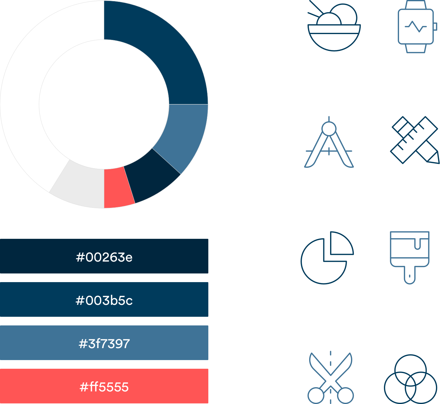
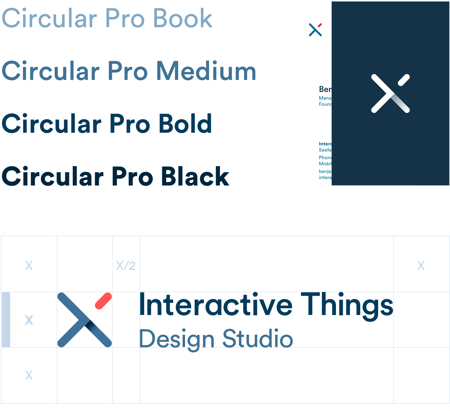
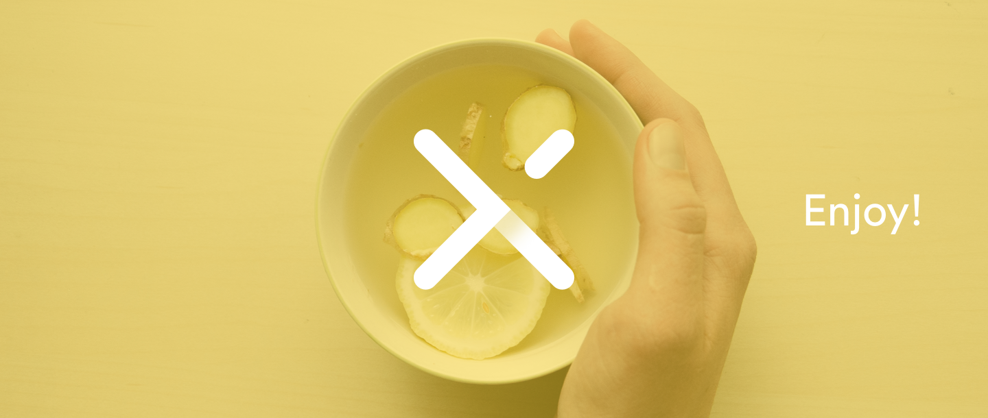
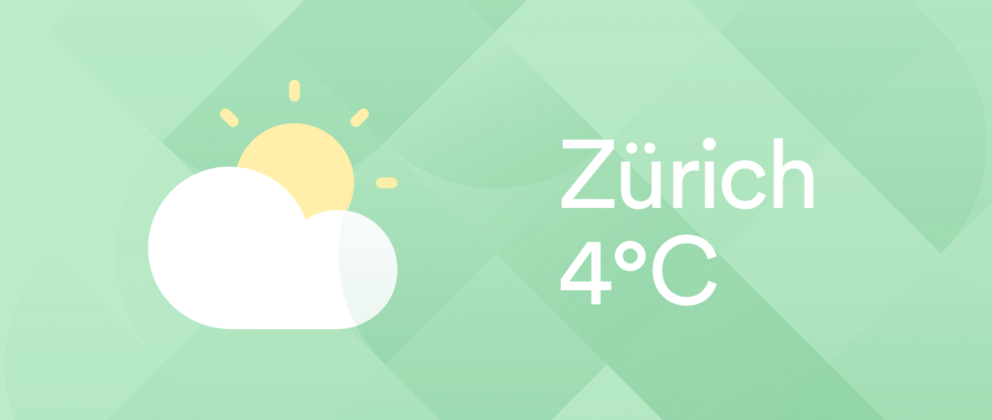
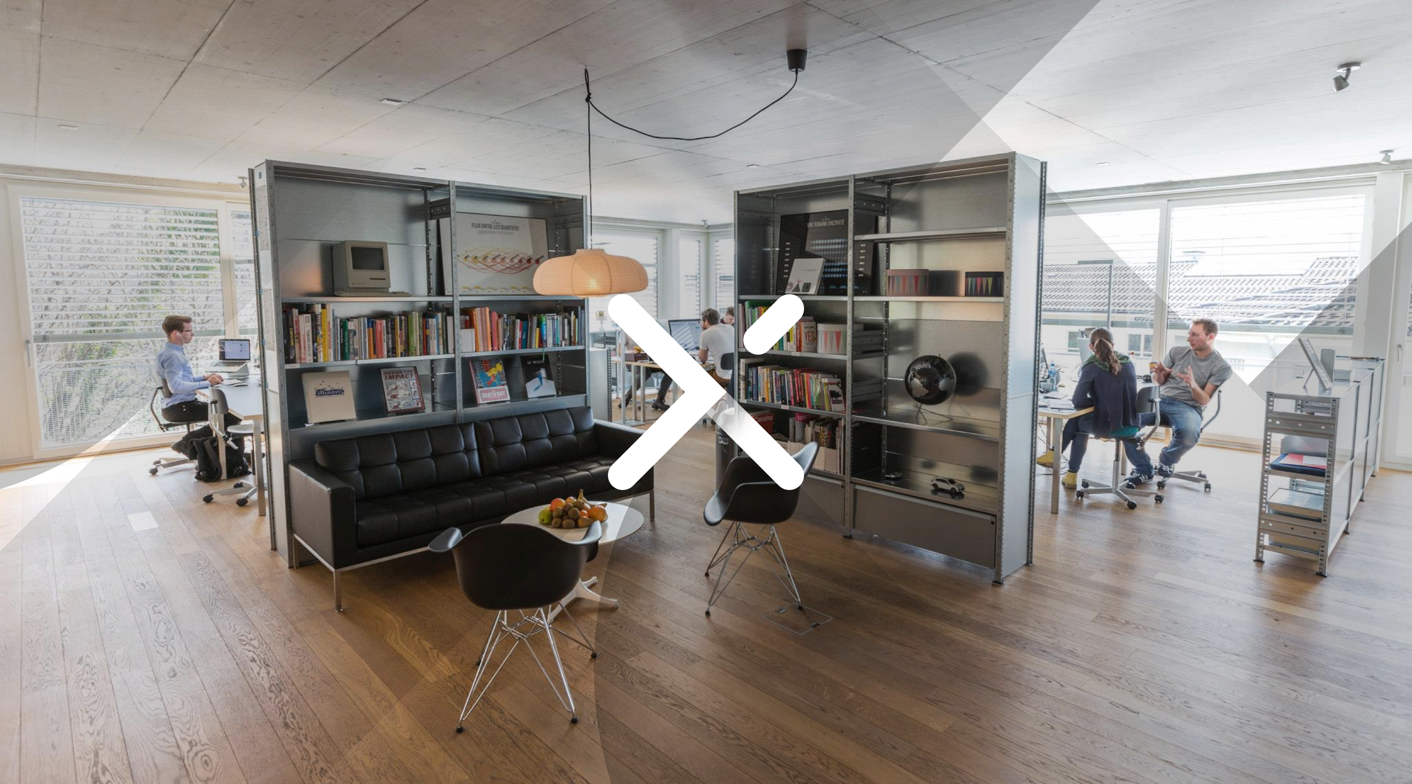
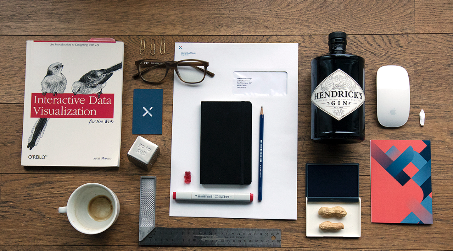
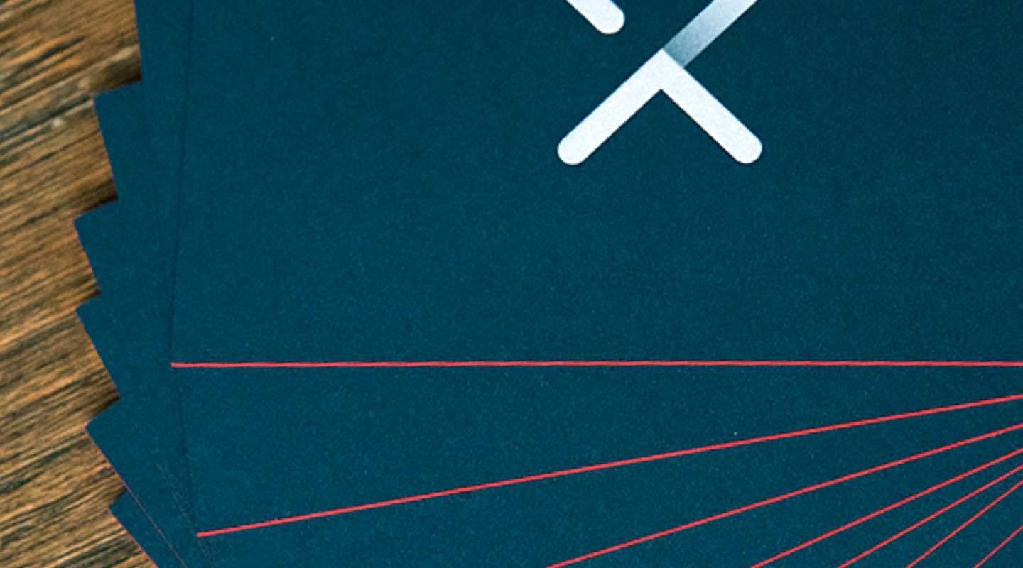
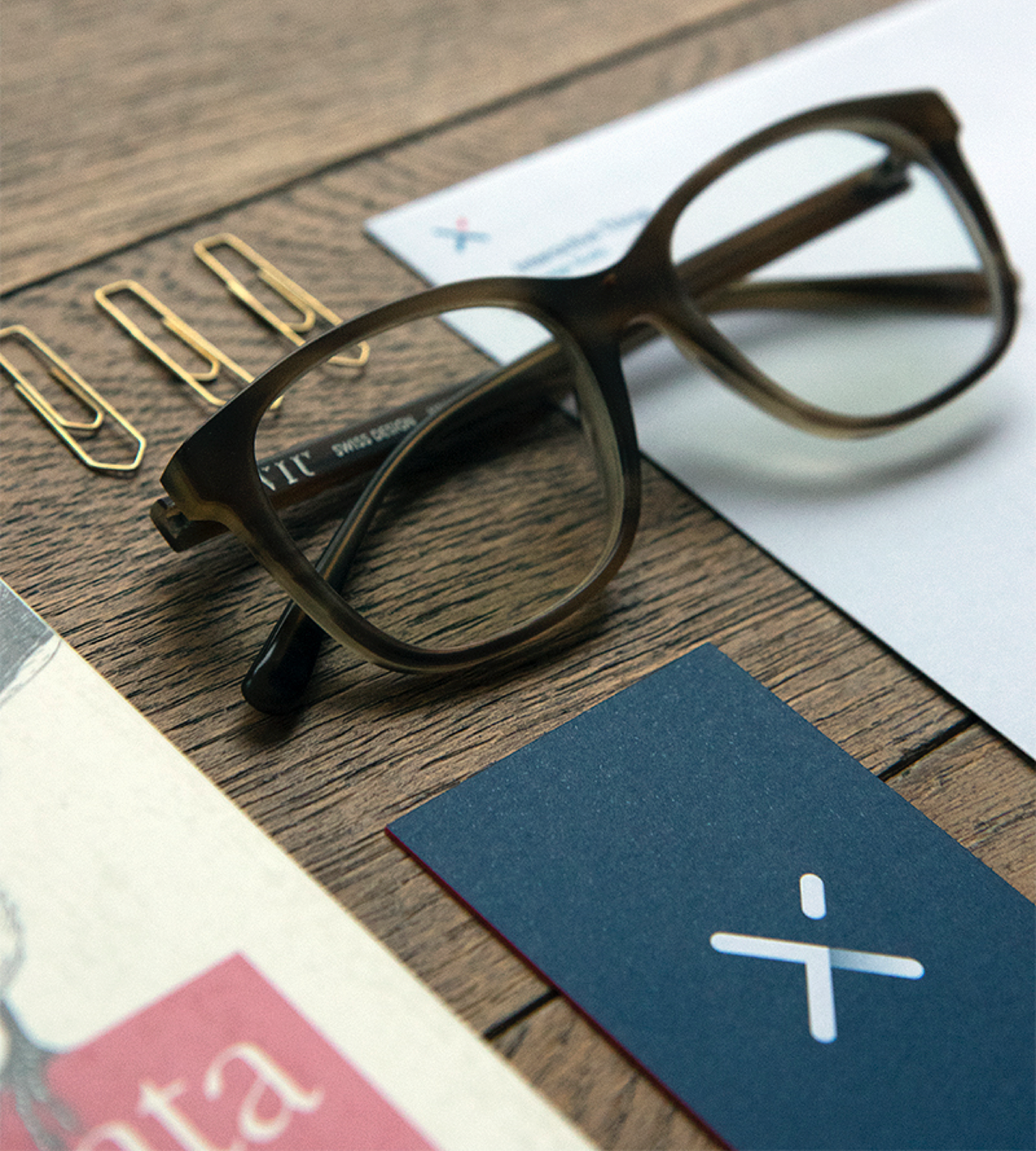
The new, vibrant brandmark represents Interactive Things on different levels. It is formed by a fusion of the three letters “IXT” and consists of two distinct elements, the base and the flare. Together they symbolize the limitless interaction between elements. In use, the mark embodies the epicenter of an area and perceivably influences its surrounding content. This interaction can be intensified by combining it with the the visual system. The corporate font, LL Circular is a contemporary looking sans serif, which stands out thanks to its clean lines and playful details.

More detailed information about the new branding can be found in our Interactive Things brand guidelines.