

Aurum Fitness AG
Aurum
Data-driven interfaces and visualizations powering an isokinetic workout system.
Aurum offers an innovative workout method using the newest technologies to provide a highly customized experience. Through a data-driven application, it aims to deploy maximal effect with minimal effort. We contributed to this workout experience by designing all digital touchpoints: the training screen, coach application, and athlete dashboard.
Highly optimized workout interface
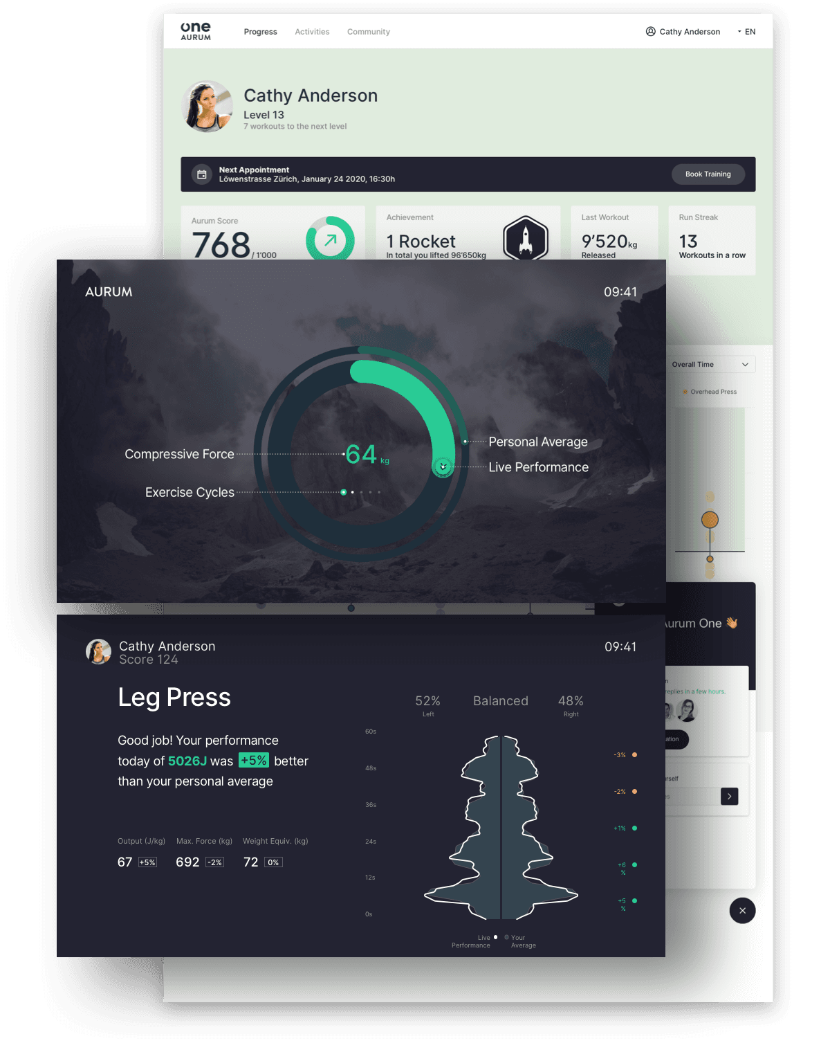
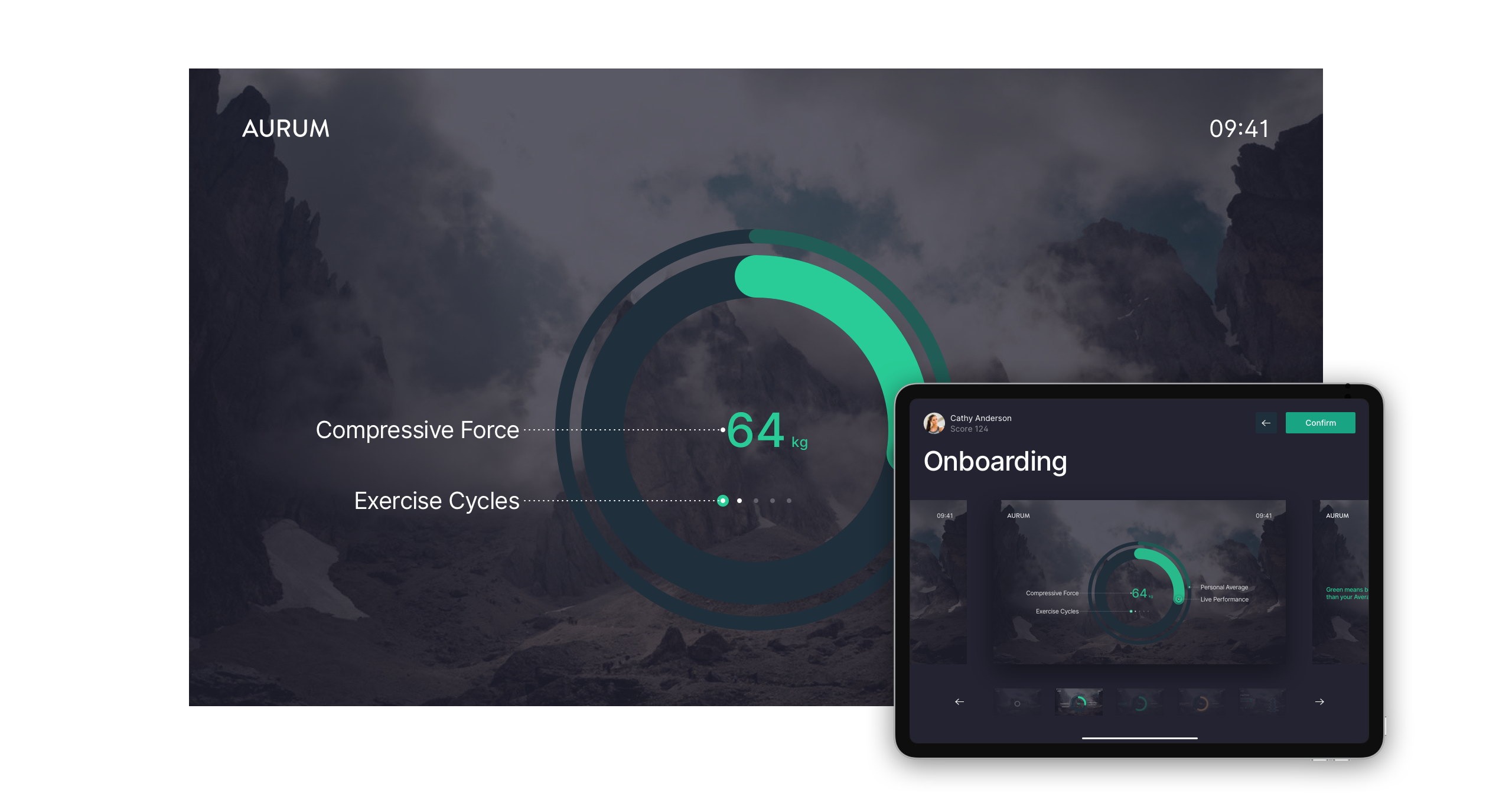
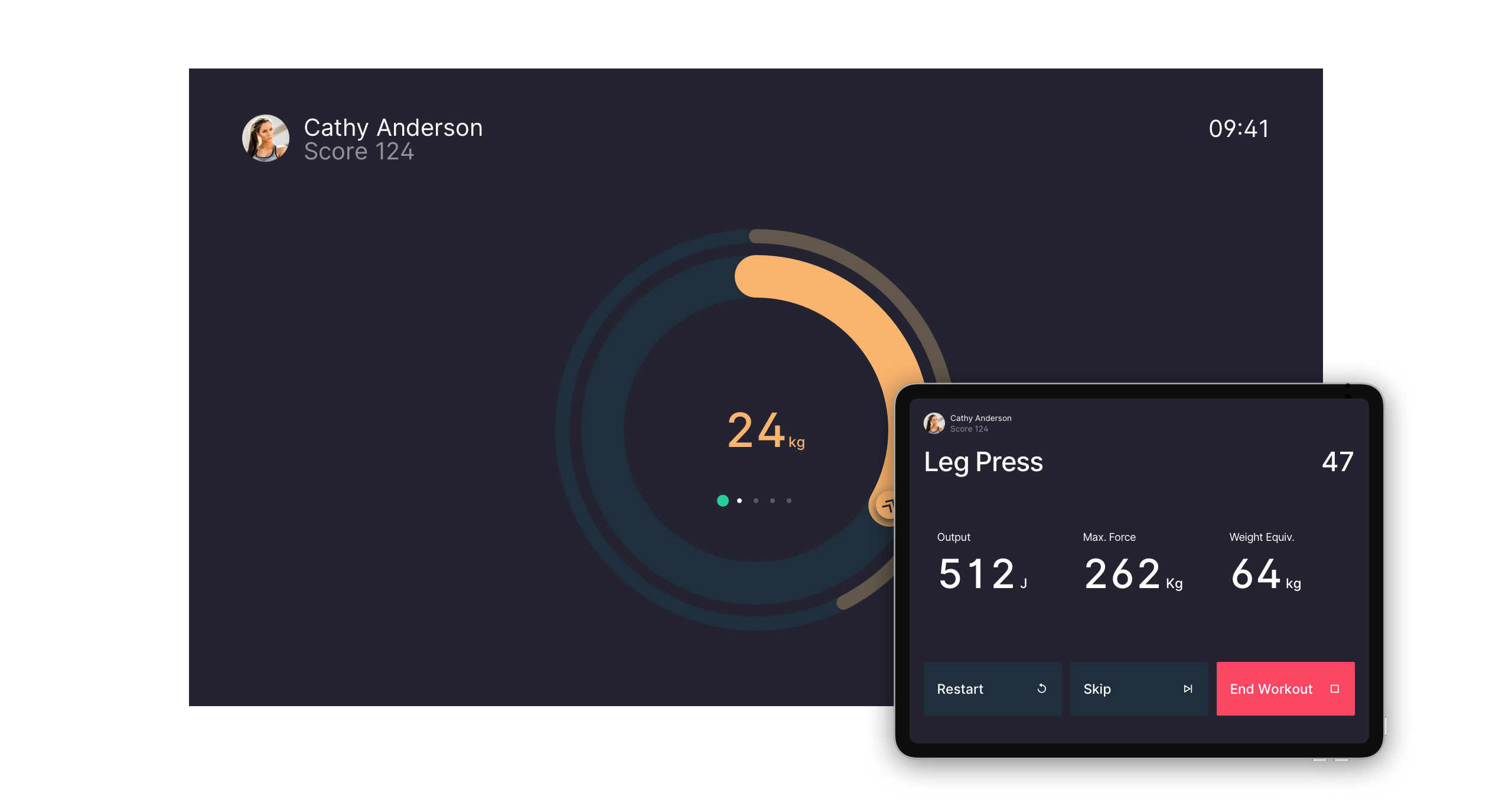
We helped Aurum create intuitive and engaging user interfaces, accompanying their newly developed computer-controlled, motorized workout machine. Our meticulously crafted visualization, evolves with time and reflects the amount of physical power applied to the helix machine. The visualization has to be intuitive and straightforward, in order to be readable under any condition, regardless of physical effort.
You compete against your own performance benchmark.
The inner ring shows your current performance, the outer ring shows your personal average.
Green means you perform better than your personal average.
Orange means that you have fallen below it.
The dot indicator shows the repetition cycle and provides an intuitive overview of the full exercise.
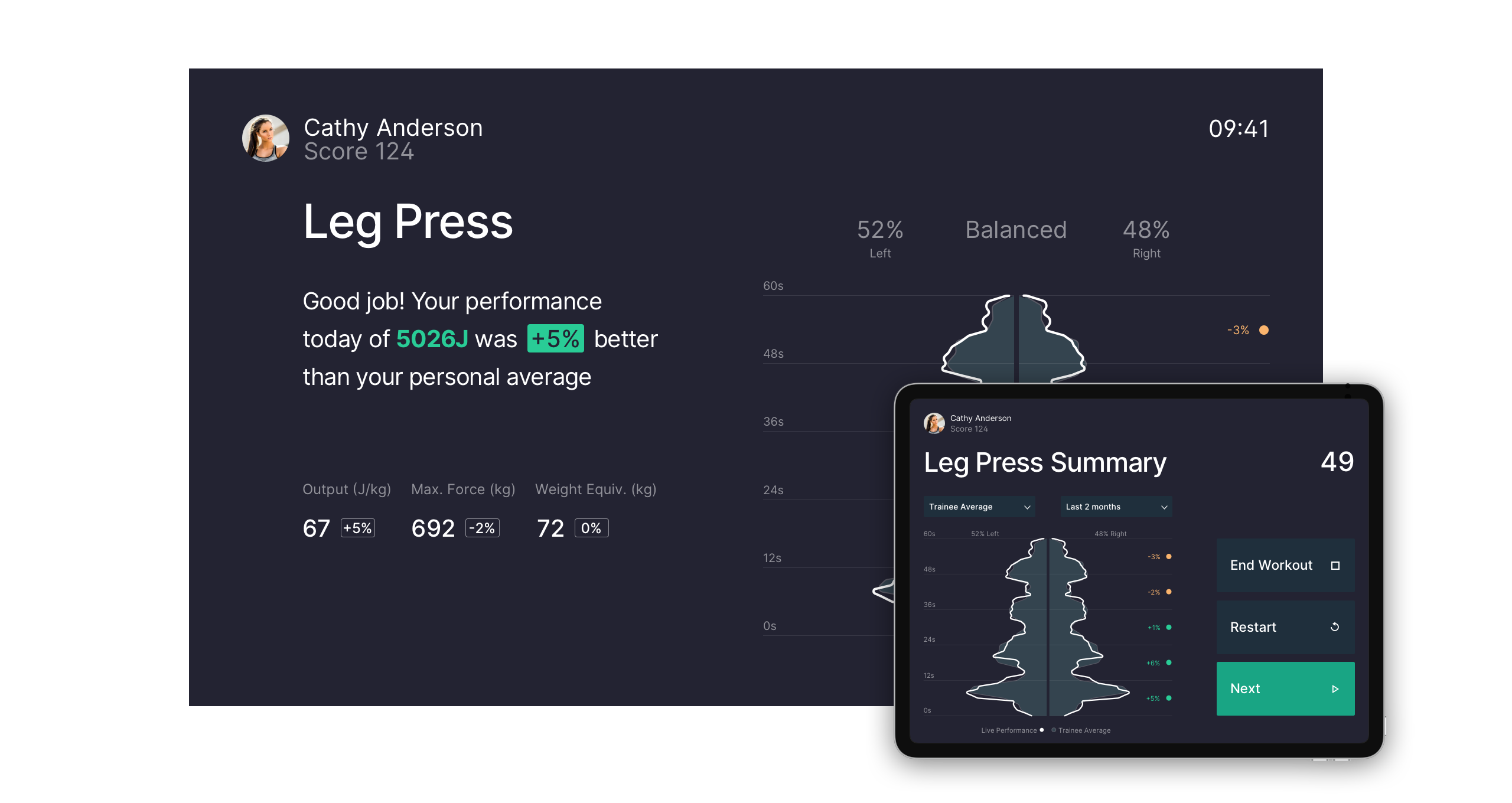
New personal bests are celebrated immediately.
Clear and motivating copy writing
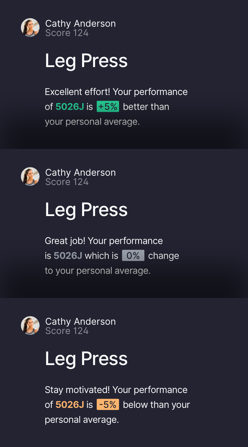
Our interface uses tailored messaging throughout the workout experience with the goal to provide the athletes with immediate feedback on their performance. In collaboration with Aurum, we defined the appropriate tone of voice to establish an honest and motivating writing style across the whole application.
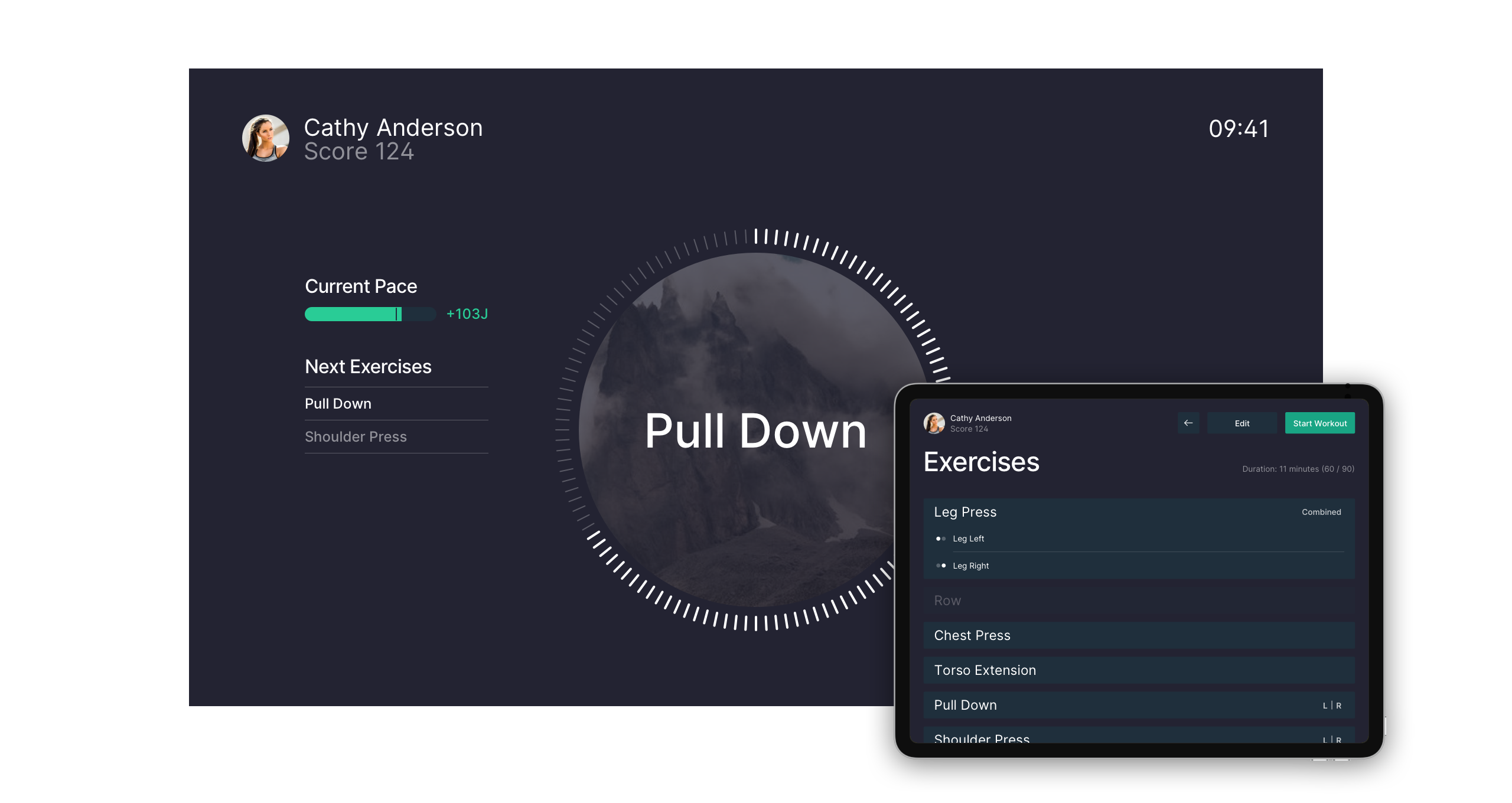
Dual-screen workout experience
To provide a consistent and cohesive experience for each target audience, we designed two separate interfaces: a «trainee» view for the athlete embedded into the workout machine and a «trainer» view to operate and monitor each phase of the workout session via a remote tablet.
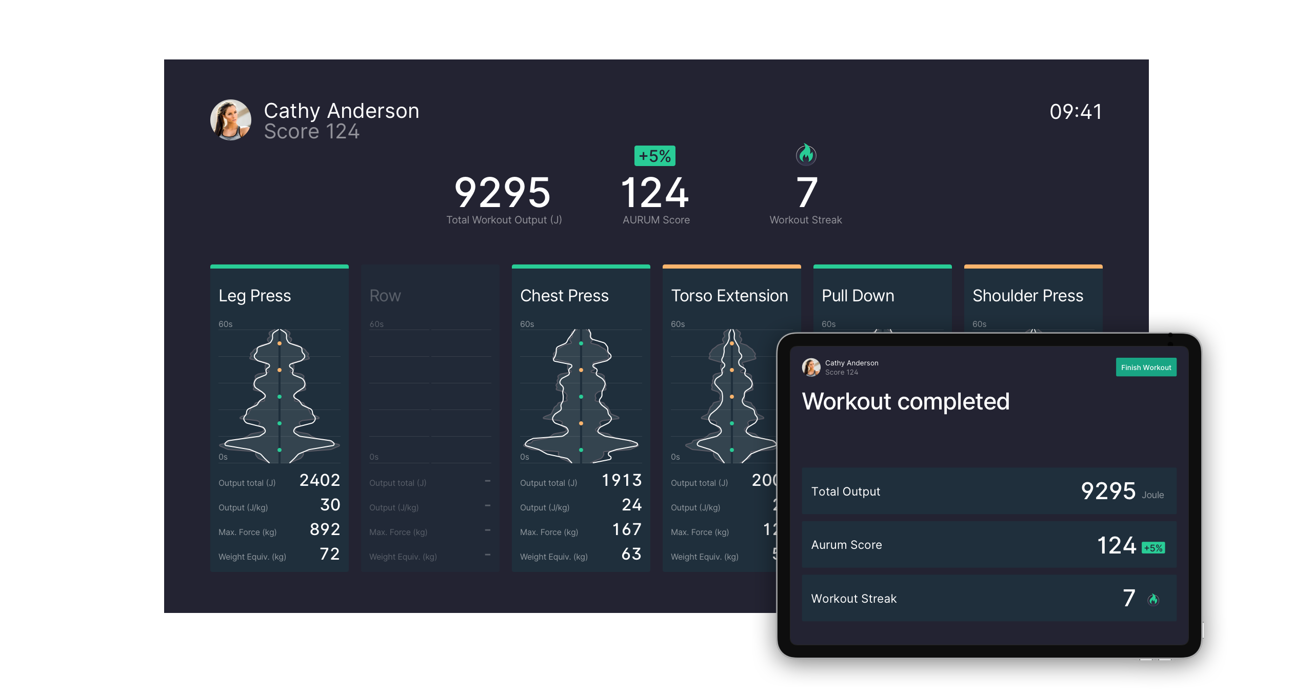
Comprehensive workout ecosystem
In addition to our solutions for the workout machine and its various connected interfaces, we also designed and developed a fully responsive web application for athletes which provides access to a personal performance dashboard, historical activities, account settings, and training schedules.
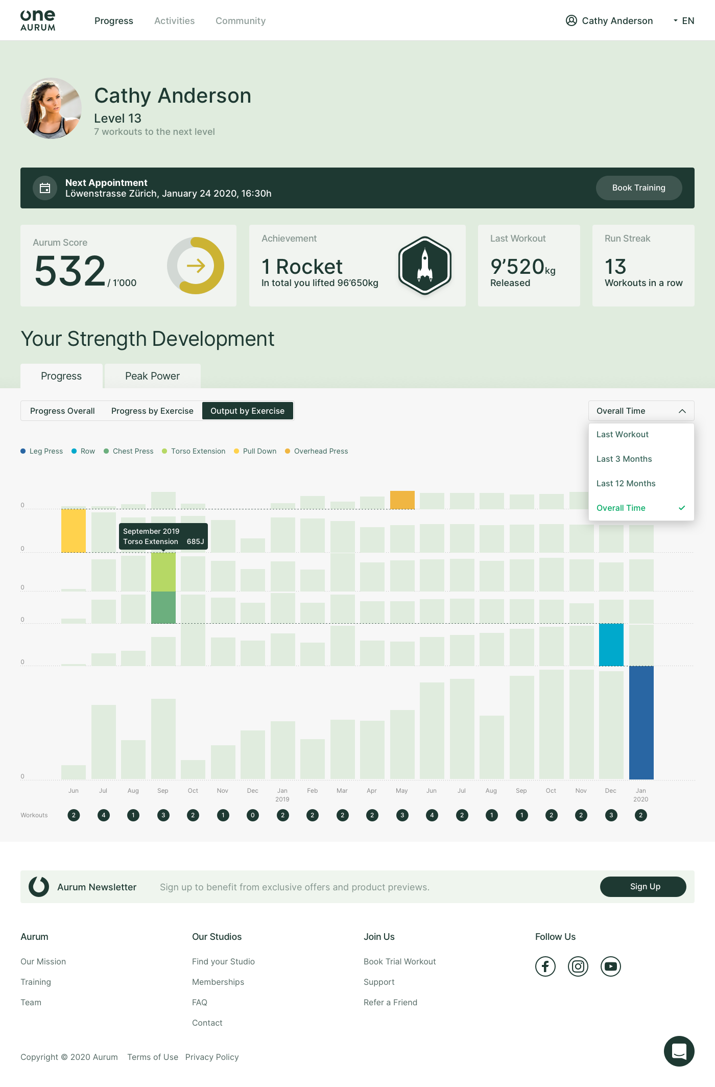
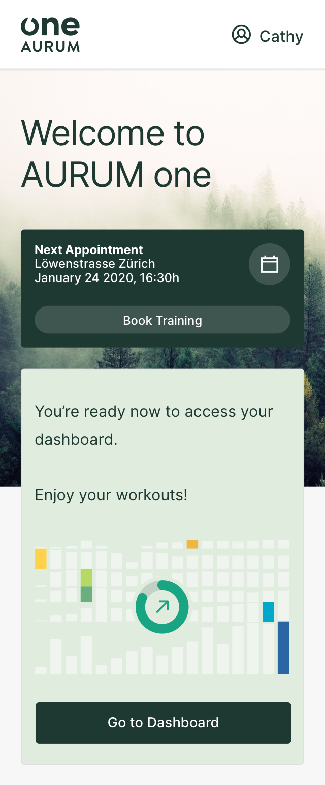
Explore your workout journey
On the dashboard, athletes can see their workout progress and peak powers. The main goal of the four designed visualization is to show a combination of progress overviews and specific performance data. Hence, patters of workout routines and strength development over time facts can be explored and evaluated for future exercises.
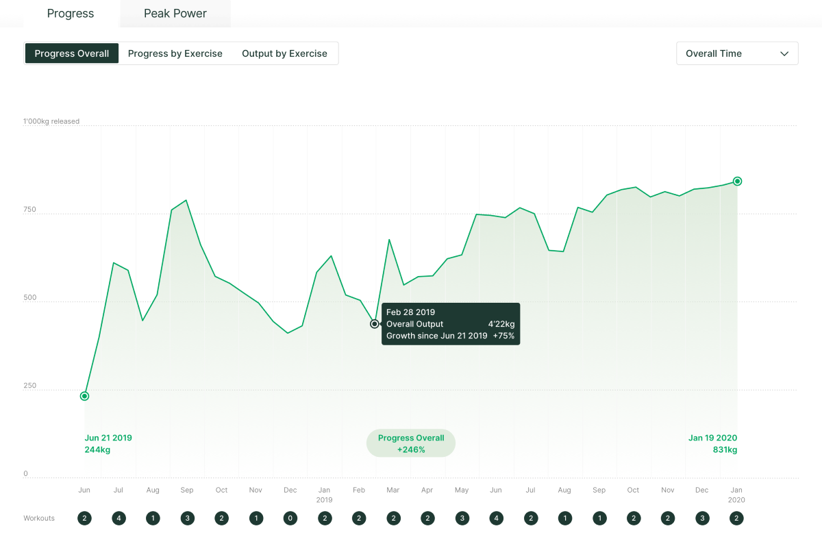
Progress overall
The progress overall chart shows the overall performance from the first training to today. It helps to identify downturns or continuous progress over time. It summerises to overall output of all performed exercises of a regular Aurum training.
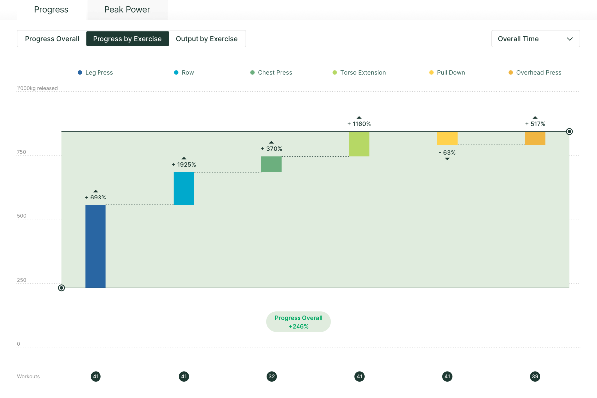
Progress by exercise
The progress by exercise chart allows athletes to compare their performance between the first and the last workout, within a certain time frame. The focus is on the personal performance improvement per exercise. Ideally all bars show positive values and increase similarly over time.
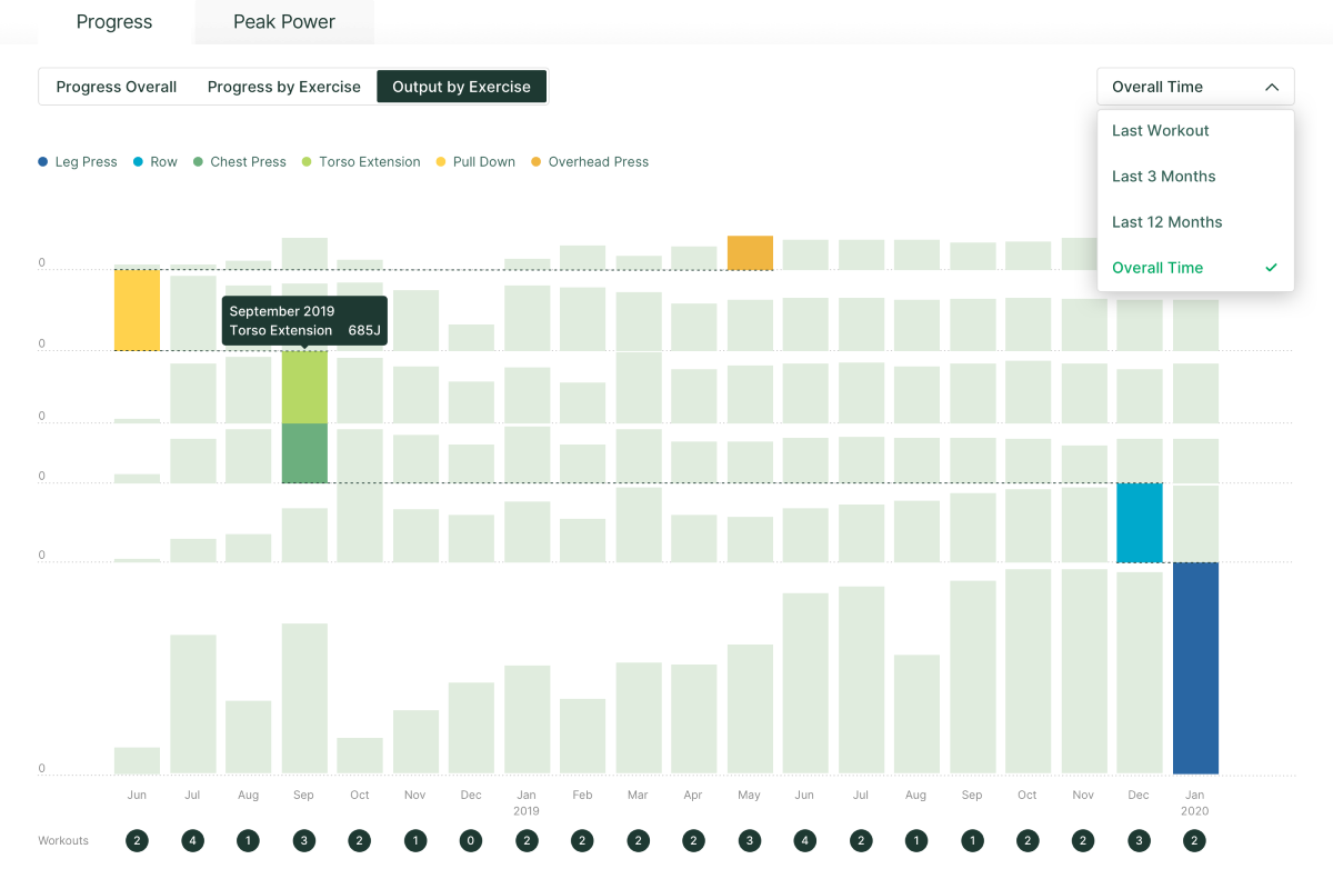
Output by exercise
What we call the «path of success» depicts the strongest performance across all exercises over time. The best result per exercise is visually highlighted and helps to identify patterns of how athletes perform. Ideally all bars increase over time to create a vertical path that visualizes the best performance in the latest workout.
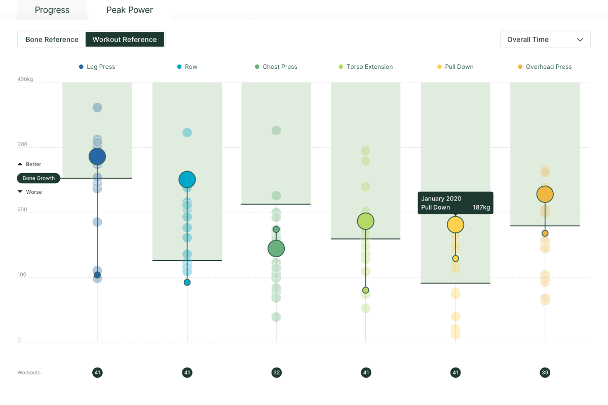
Peak power reference
The peak power chart visualizes your max-strength per individual exercise and indicates if you already reached the optimal «bone growth» zone. Performing within the optimal zone helps to strengthen your bone structure and mitigate the risk of osteoporosis.
Details
| Sector | Technology |
| Product | Data Experience |
| Impact | Health & Fitness |
| Release | July 2020 |
Services
- Product Strategy
- Interface Design
- Interaction Design
- Data Visualization
- Software Engineering
Credits
- Christoph Schmid
- Gerhard Bliedung
- Jan Wächter
- Solange Vogt
- Tomas Carnecky


Interested in working with us?