

Federal Office of Public Health
Covid-19 Dashboard
Dashboard about the COVID-19 pandemic in Switzerland for the Federal Statistical Office
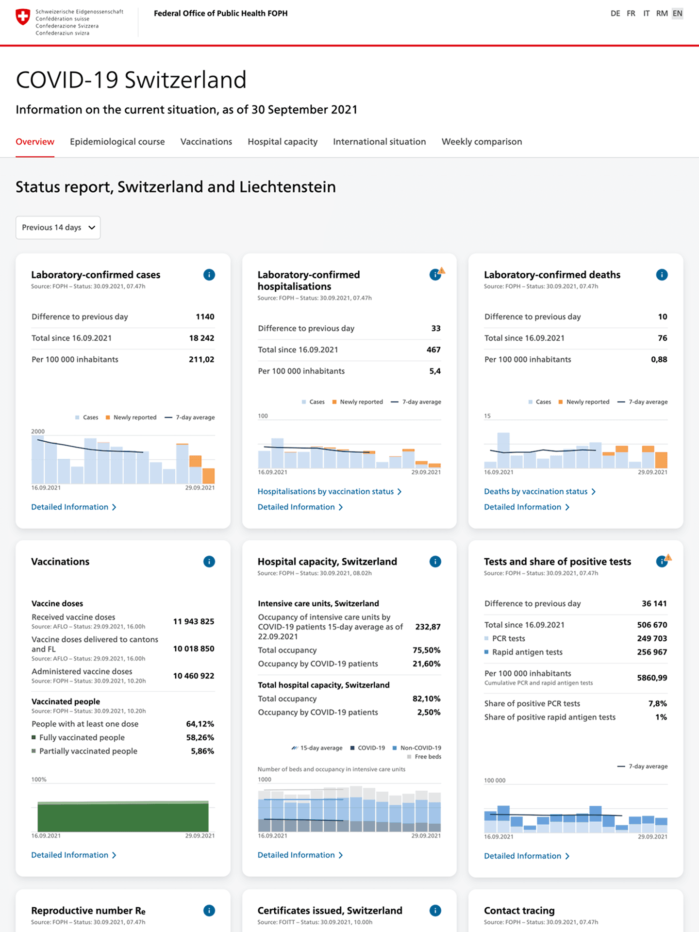
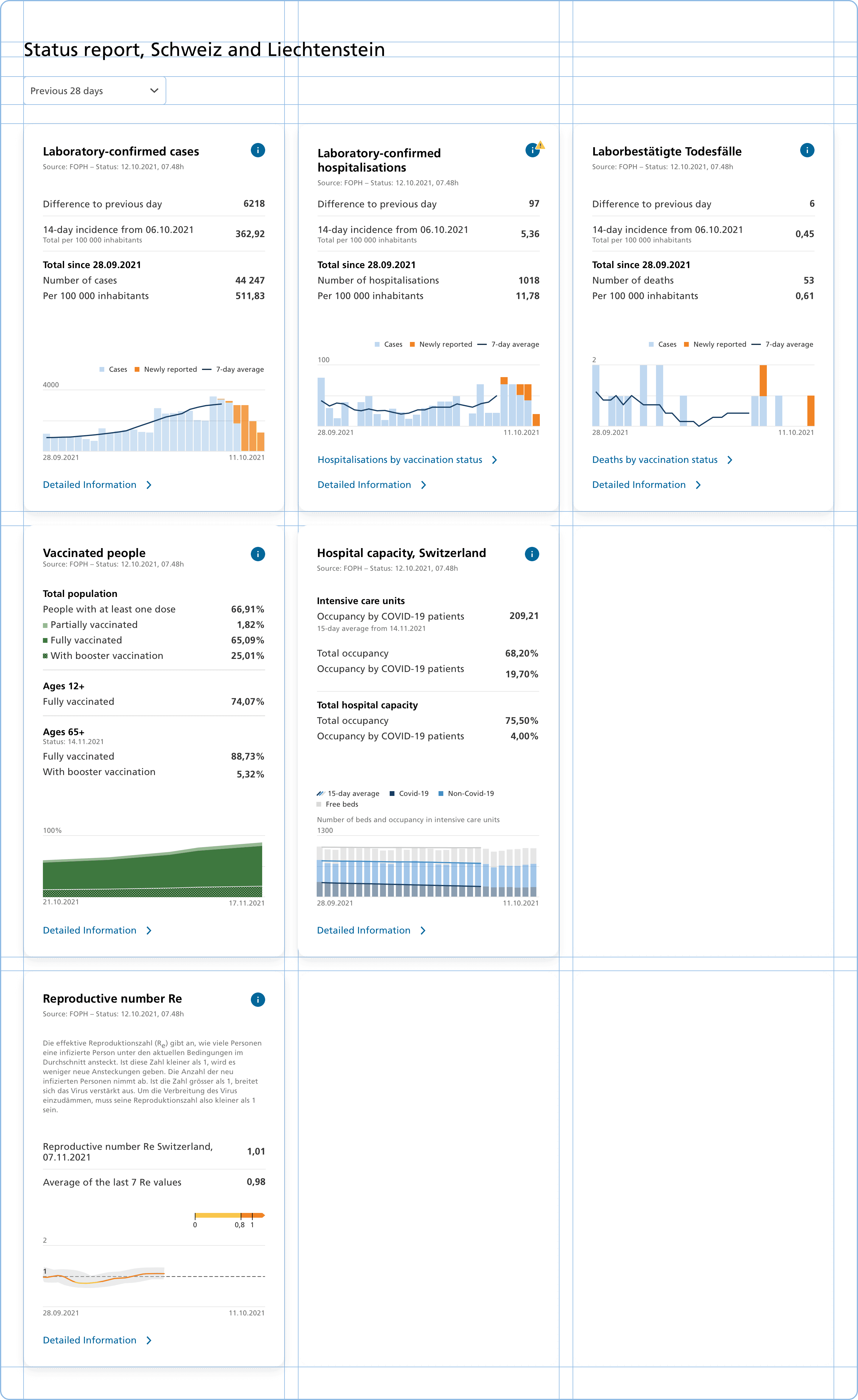
The Covid-19 Dashboard is the authoritative source of information about the epidemiological situation in Switzerland. The platform provides a diverse audience with understandable insights about the pandemic in the form of interactive tables, charts, and maps with a focus on readability, usability, and accessibility.
Responding to ever changing needs
The epidemiological situation of the pandemic is ever changing and so are the needs of our audience. To respond to these changes, we've designed a flexible layout and interface system that can accommodate new content.
Building a modular chart library
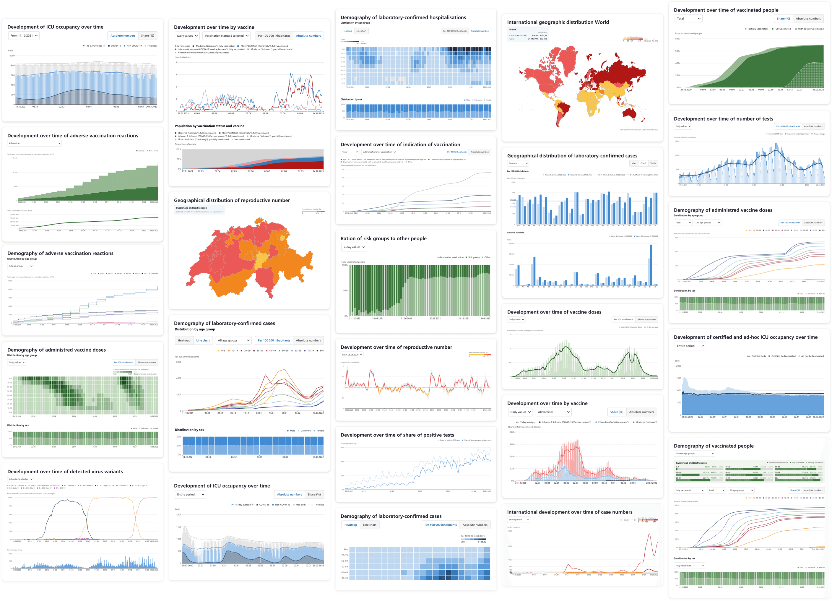
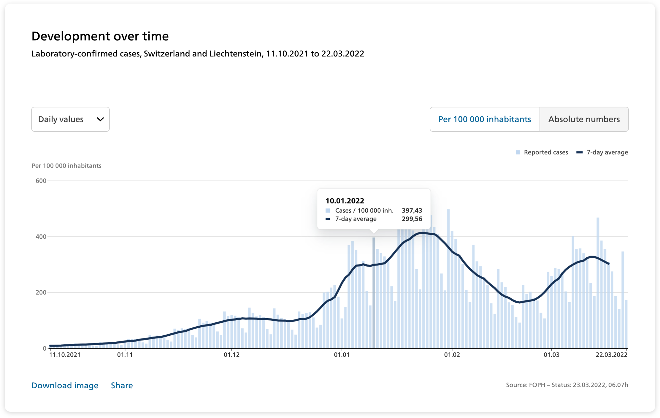
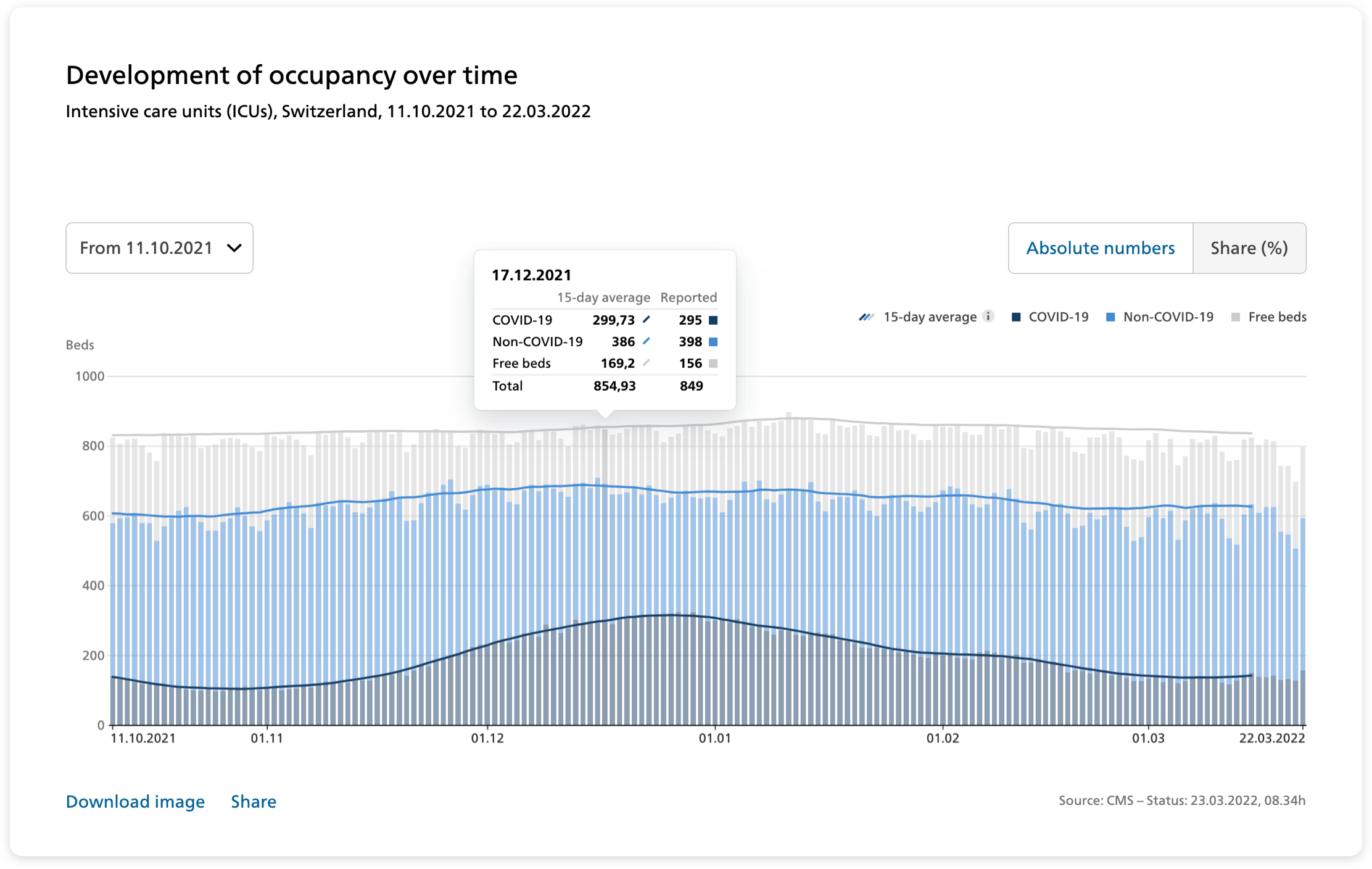
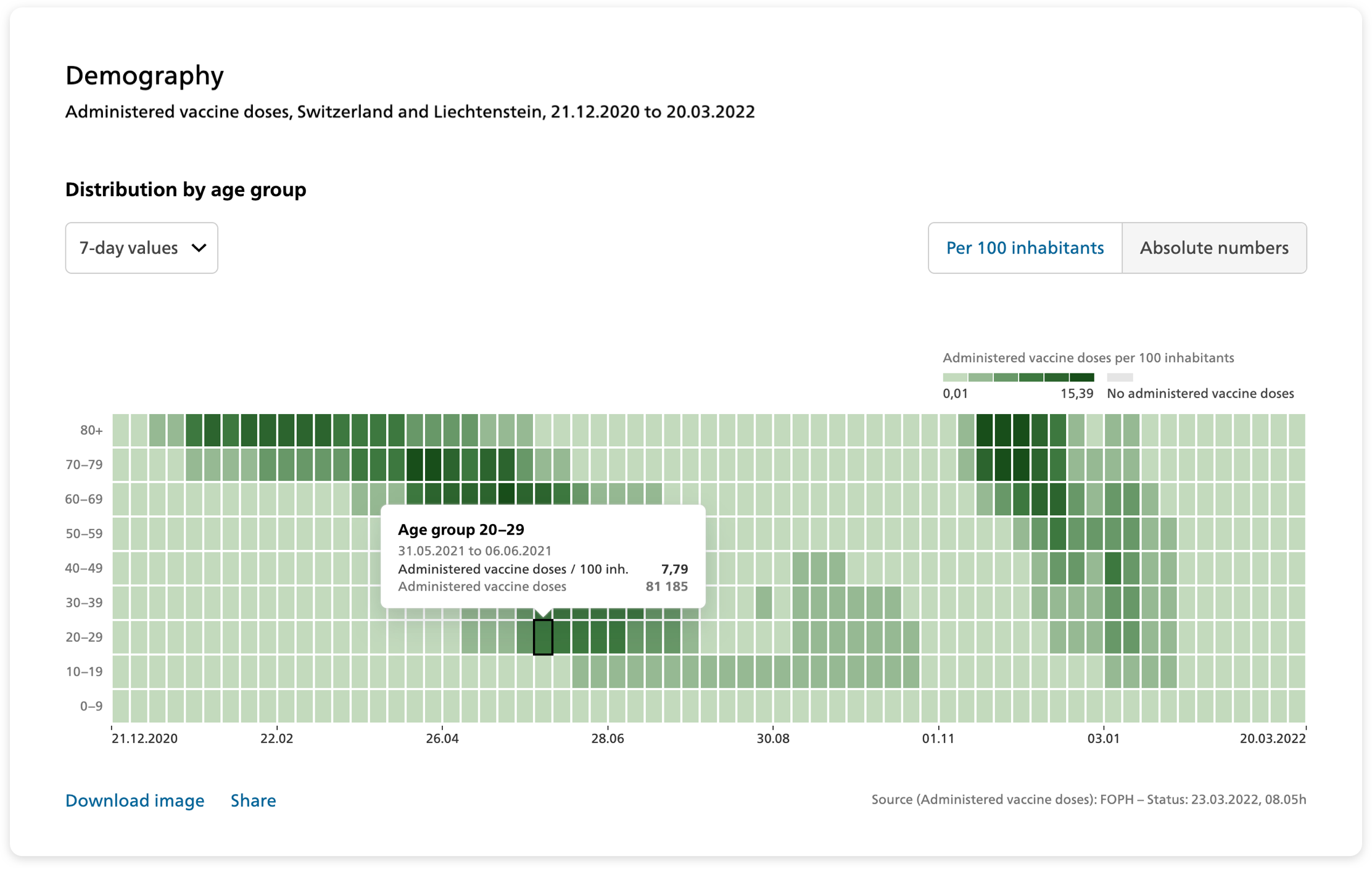
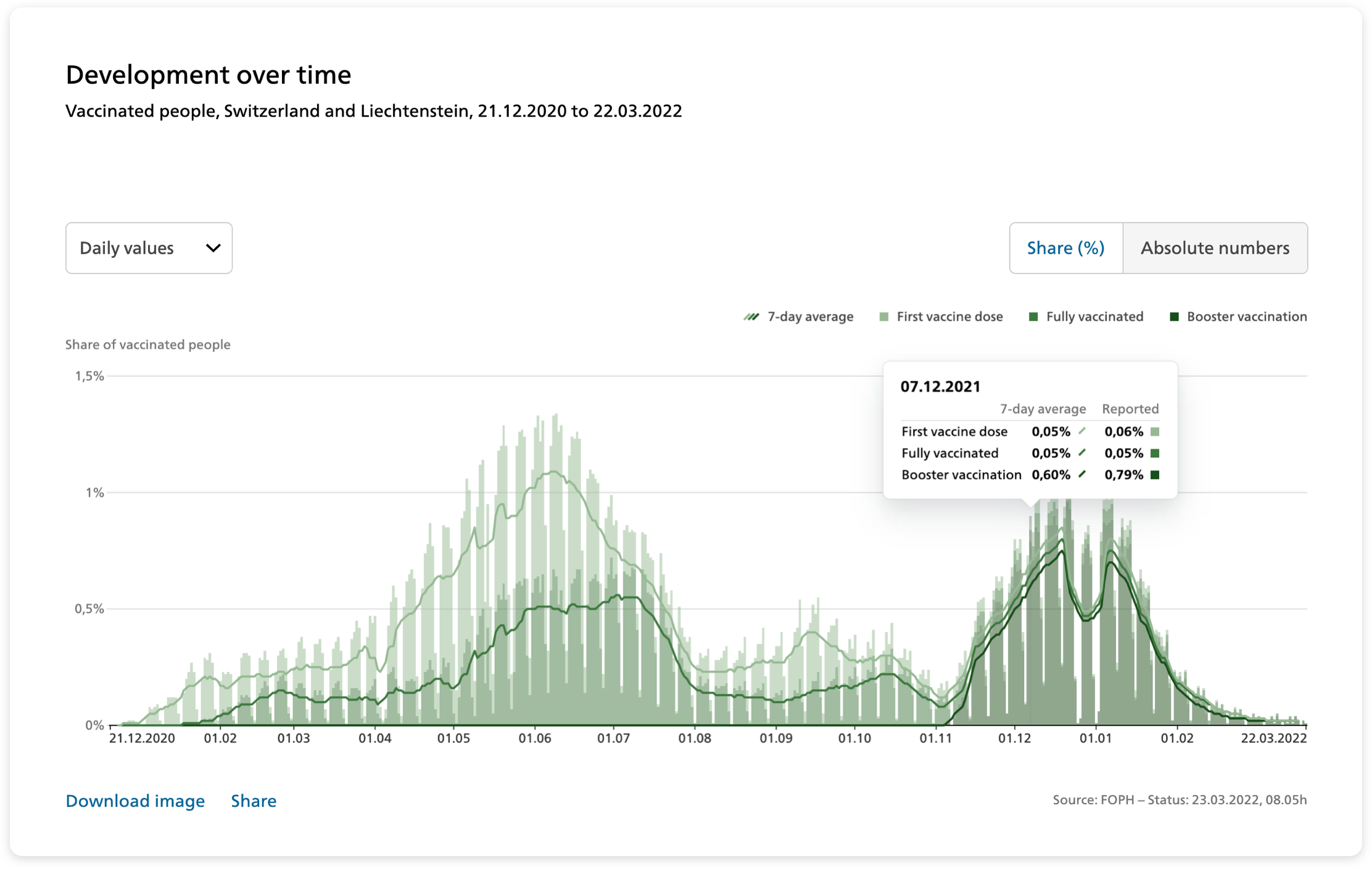
The platform hosts a wide variety of metrics including laboratory-confirmed cases, hospitalizations, deaths, number of tests, vaccinations, virus variants, and many more. The custom-made chart library was intentionally designed to be understood by a broad audience independent of their data literacy.
Turning data into insights
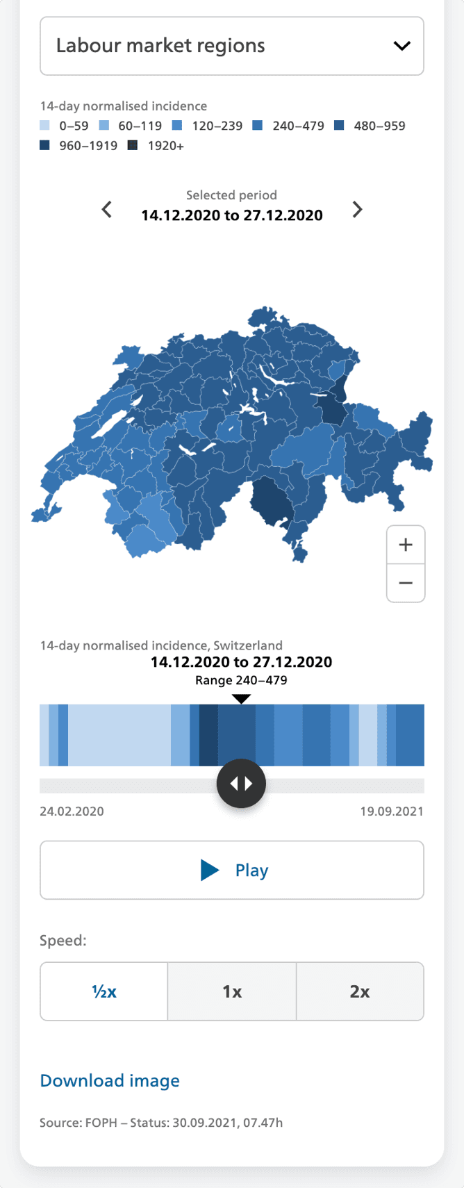
The interactive data visualizations were specifically designed to emphasize the key aspects of each metric. Time series highlight trends over the course of the pandemic, heatmaps reveal patterns across demographic groups, and choropleth maps show densities across geographic regions.


Details
| Sector | Government |
| Product | Data Dashboard |
| Impact | Health & Fitness |
| Release | October 2020 |
Services
- Interface Design
- Interaction Design
- Data Visualization
Credits
- Christoph Schmid
- Gerhard Bliedung
- Solange Vogt
- Tania Boa
- shiftcode GmbH


Interested in working with us?