

Going Digital Toolkit
Data platform about digital transformation for the OECD


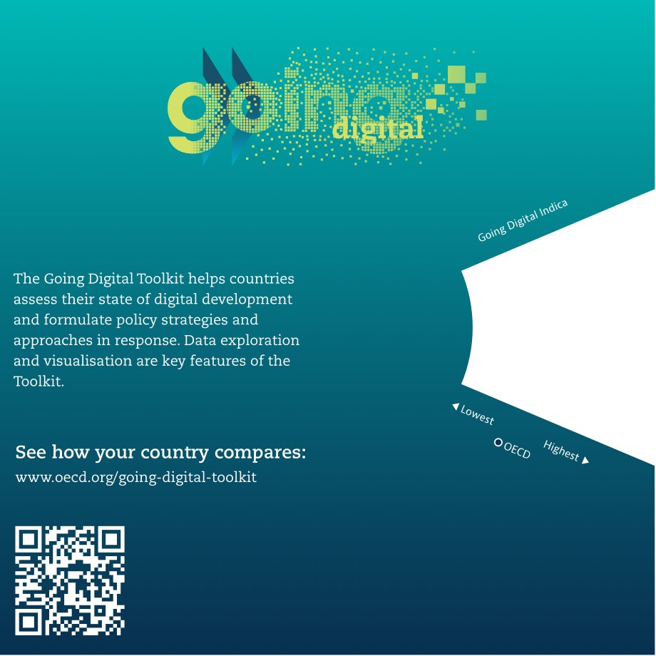
The Going Digital Toolkit helps countries assess their state of digital development and formulate policy strategies and approaches in response. In collaboration with the OECD, we created an interactive data platform to visualize several indicators and link them to publications, policy guidances, and thematic ensembles.
Holistic and inclusive approach
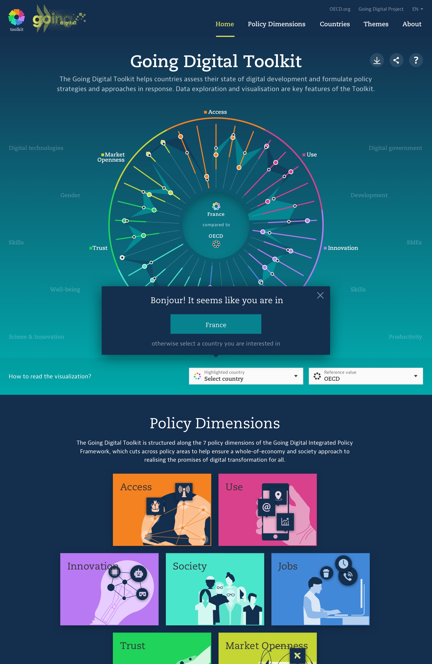
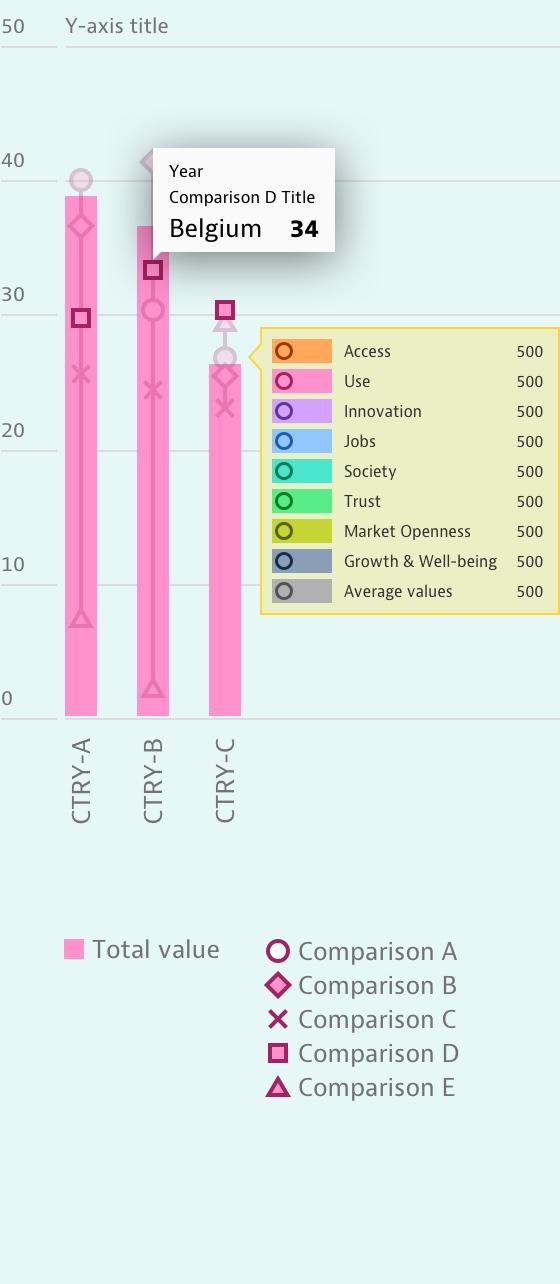
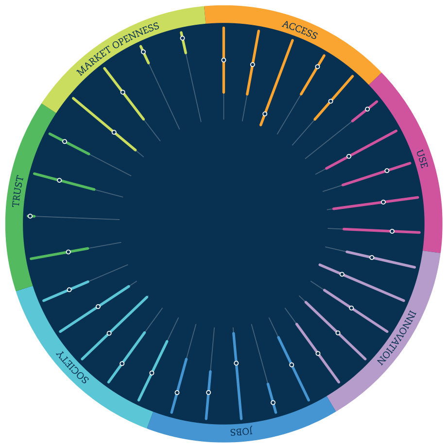
The toolkit supports the “2019 Going Digital Synthesis Report” by making the quantitative and qualitative information visually explorable and comparable. The toolkit’s center piece, an interactive radial plot, provides an overview of the state of the digital transformation for all OECD countries and allows to put individual countries in perspective. Showing all countries as unified and equally important reflects OECD’s holistic and inclusive mindset.


Exploring data by dimension or theme
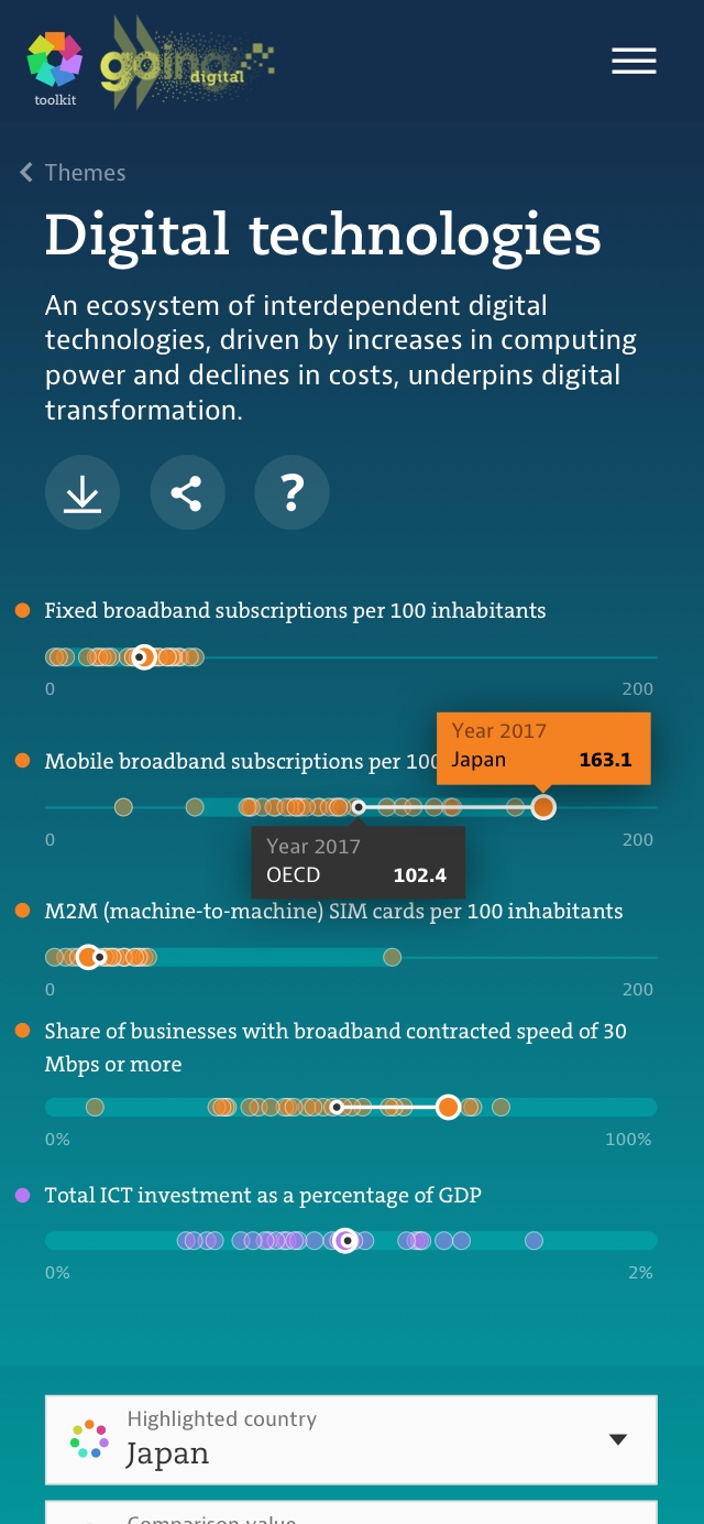
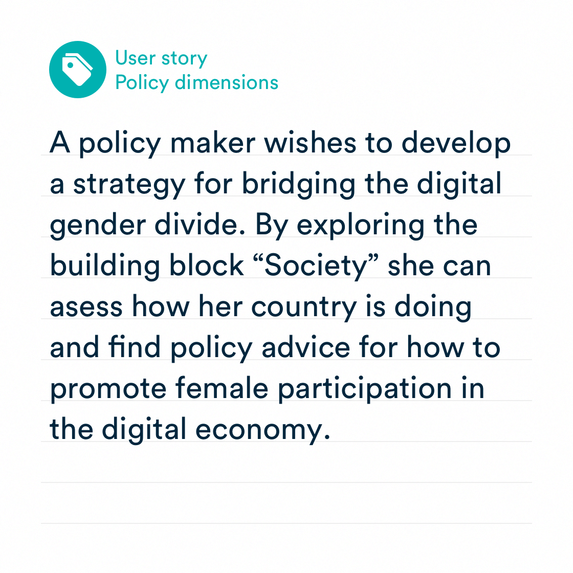
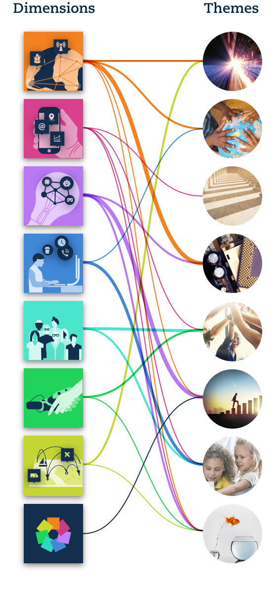
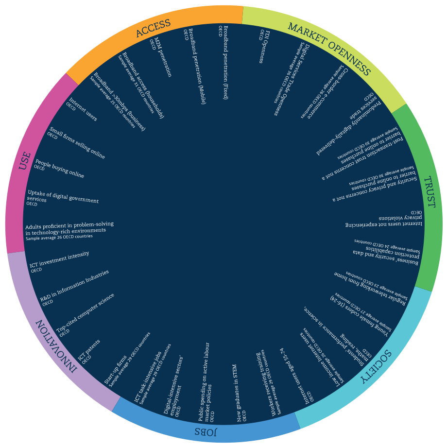
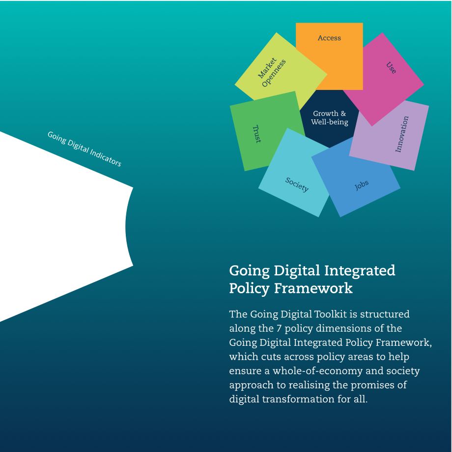
Eight dimension of opportunities and risks of digital transformation such as jobs, trust, or innovation are included in the toolkit. A set of indicators within each dimension allows users to assess a country’s state of digital development. But digital transformation also cuts across many aspects of the economy and society. The themes are cross-dimensional entry points to the same indicators and focus on specific issues like skills, productivity, or gender. By providing non-linear and context-specific access to these indicators, the toolkit serves multiple use case with one interface.
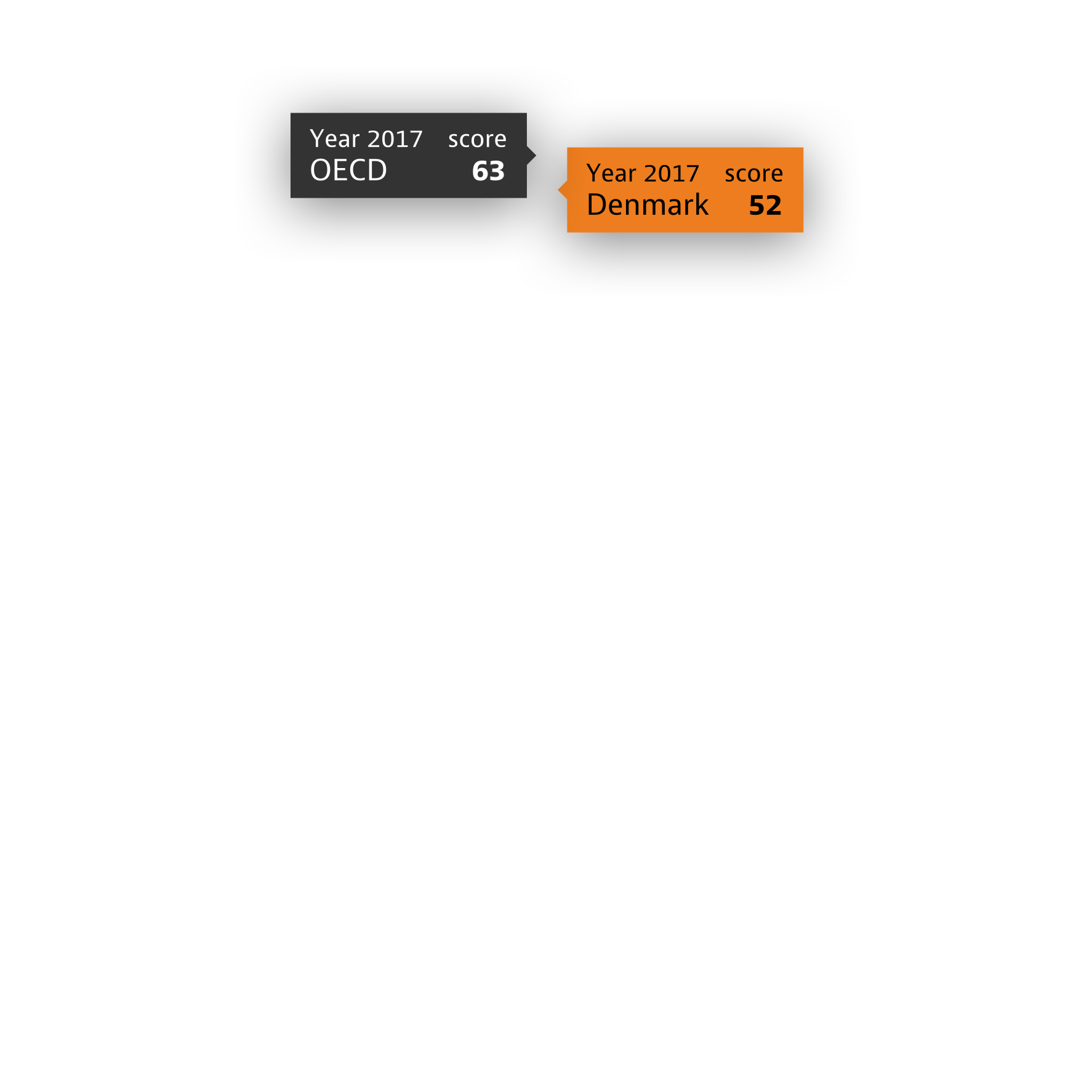
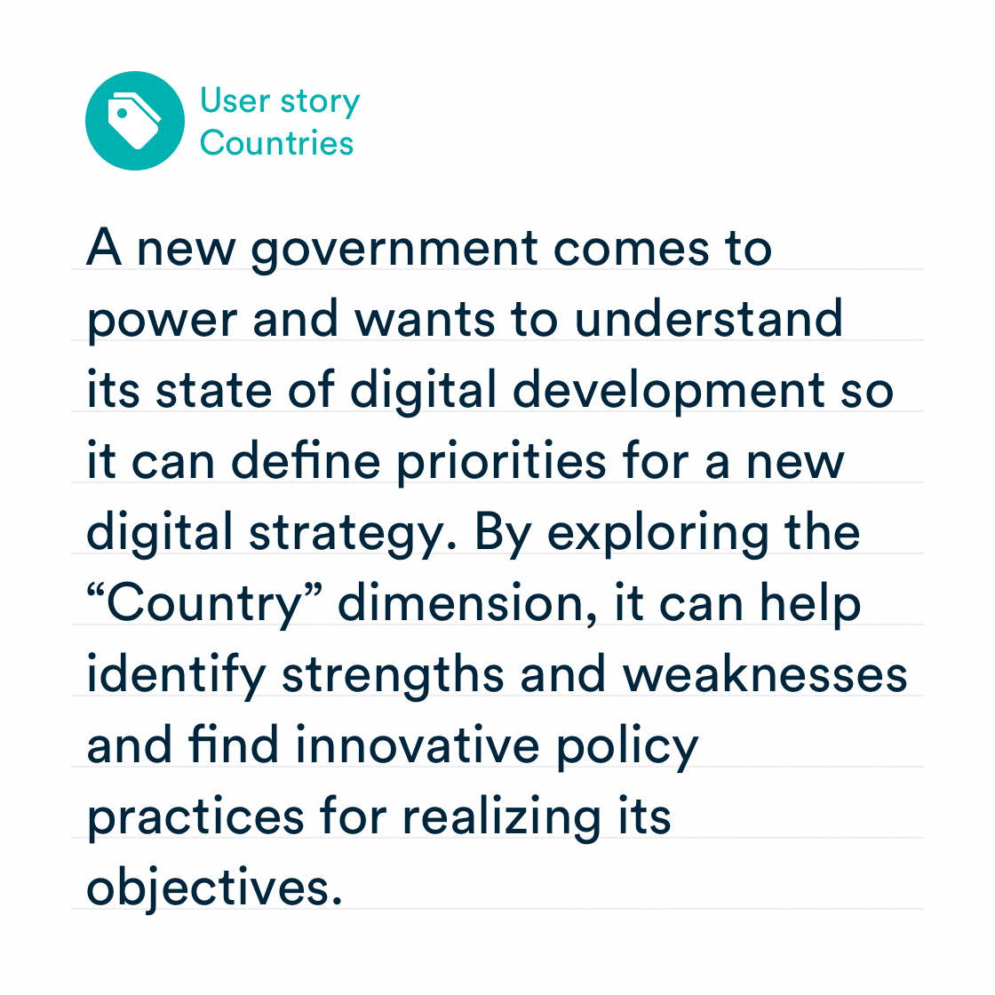
Data portraits of countries
Each country can be recognized and distinguished by its unique data portrait.


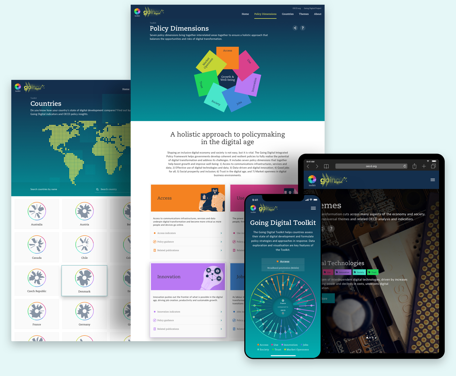
Fully responsive design
To make the toolkit universally accessible, we optimized the design for all device categories. From small smartphones to large presentation screens. Our work didn’t stop with visually restructuring the content: each interaction and behavior was honed to create an effortless and delightful experience.
Bold yet accessible design system
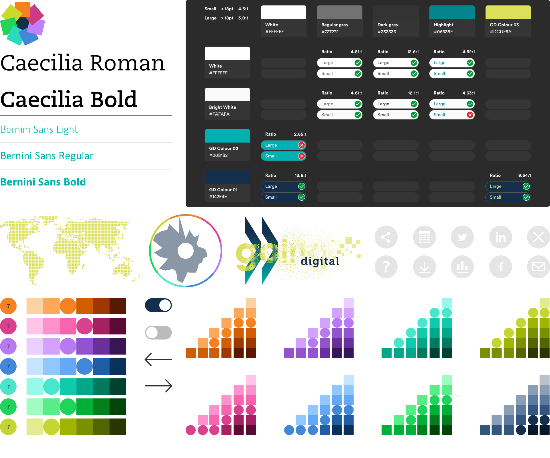
We wanted the toolkit to stand out from other data platforms and be accessible to a wide audience. To achieve this, we’ve developed a comprehensive design system for colors, icons, typography, visualizations, and interface elements. The result is a bold visual appearance that fits neatly into the overarching Going Digital project while adhering to the standards of web content accessibility.
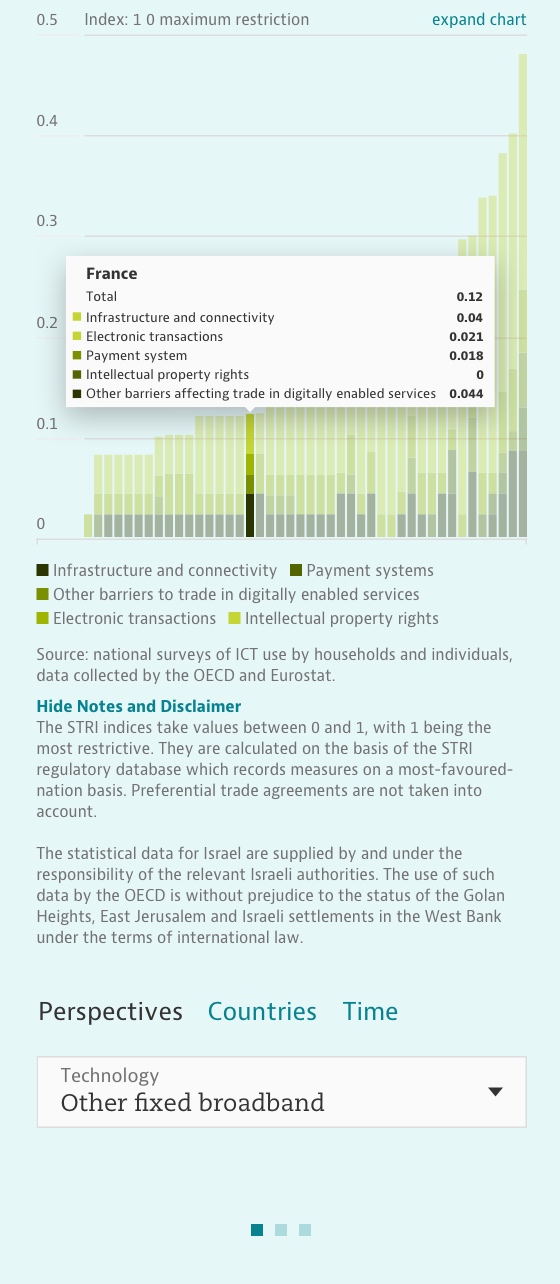
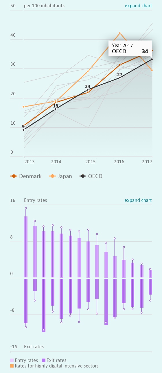
Custom-made chart system
The data underlying each of the 43 indicators included in the toolkit can be analyzed with detailed charts. But each data set offers unique opportunities and challenges for how to best visualize it. To provide the right chart with the right features for each indicator, we’ve built a modular chart system that’s consistent and scalable.

A project in collaboration with the OECD
Realization
| Project Start: | November 2018 |
| Project Release: | March 2019 |
Services
- Strategy
- Research
- Interaction Design
- Interface Design
- Information Design
- Data Visualization
- Software Engineering
Credits
- Christoph Schmid
- Flore de Crombrugghe
- Jeremy Stucki
- Luc Guillemot
- Solange Vogt
- Tomas Carnecky


Interested in working with us?